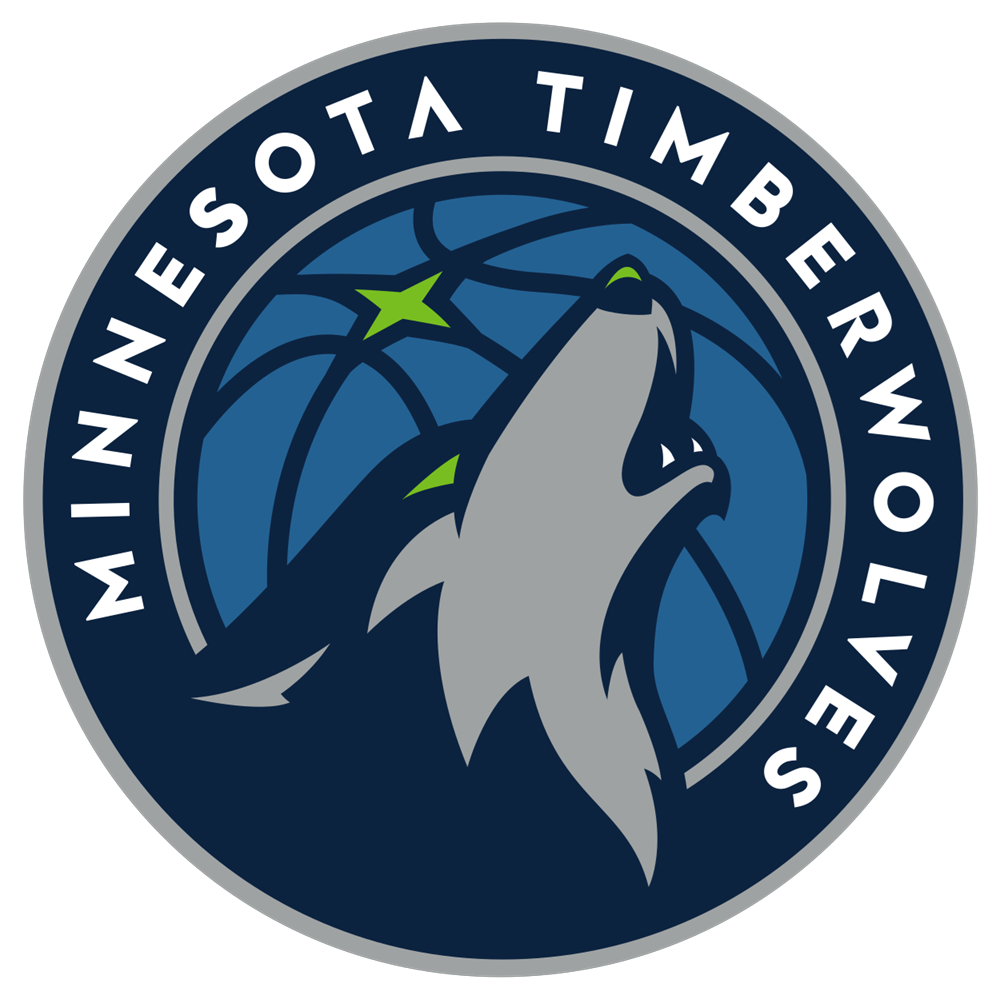
Logos are big deal in sports, even if they mean absolutely nothing to the results and performance of players. Still, the colors and design need to pop. Fans can get behind a team only for the aesthetics of their logo, and it never hurts that a good design can lead to merchandise sales. Folks buy clothes and gear for their looks just as much as they do to show their support. The Minnesota Timberwolves are the latest team looking to mix things up with a fresh take on their logo and tweaked color scheme, it seems. Their new logo may have leaked in an online newspaper ad, as discovered on Reddit. The logo features a howling wolf, similar to one of the many variants of their logo they've used for years, with a few shades of blue, a pop of lime green, and some white accentuations and text. It's definitely a clean logo, which you can see below:
The Timberwolves are probably wise to go in for a re-brand right now. Karl-Anthony Towns is a bonafide star already, becoming one of the best big men in the NBA in his first two years in the league.
Andrew Wiggins continues to live up to the hype as a prototypical wing, and Zach LaVine is a fan favorite if only for his insane athleticism and dunks. This is a young up-and-coming team that fans can get behind as they try end a 13-season streak of missing the playoffs.
The logo, just as any logo will, received a fairly mixed response on social media. Some fans were digging the streamlined look and new palette of colors:
Others thought it was a bit too basic:
While some pointed to the fact that it resembled the kind of logos some blogging platforms use for their team sites:
Overall I'd say the logo is pretty good. It's not groundbreaking, nor will it have folks running out to buy a Timberwolves jersey — their young core being so good will take care of that — but it doesn't miss the mark. They played it safe, making a logo that's hard to fault.
Kudos to Minnesota, though, for putting their best foot forward and embracing their exciting future. It really is a new era for the Timberwolves, and while they don't have the win-loss results to speak for it yet, anyone watching knows Wiggins and Towns are the real deal.
What do you think about the new logo? Let us know in the comments!
