


Premier League badges are some of the most recognisable logos in the world.
So many memories come flooding back for football fans when they see the insignia of the club they support and perhaps some more painful recollections from those of their rivals.
There's something so iconic about Manchester United's red devil cast on yellow, the proud cannon of Arsenal's crest and Liverpool's astute Liver bird just to name a few.
However, being so famous doesn't necessarily make them good looking and supporters have long debated which Premier League badges are the most aesthetic over the years.
So, here at GIVEMESPORT, we've decided to have our own two cents and we're hopping on the trend of 'TierMaker' to rank all the badges from 'downright ugly' to 'simply beautiful'.
- Every Premier League club's biggest sale
- The Premier League's 5 best striking duos
- The Premier League table if there was no VAR
Ranking Premier League badges
And let us disclaim that we're purely judging the badges on their visual designs, because we appreciate each and every crest means something different and special to individual supporters.
Check out our final selections below and plot which changes you would make to the order:
Downright ugly
Norwich City
Burnley
You've got to feel sorry for Norwich because green and yellow is a terrible palette to work with, but we can't unsee the ugly-looking lion - how big are his eyes? - and the messily arranged castle and canary.
As for Burnley, there's just way too much going on from the lego-looking constructions, two animals, about a million different symbols and a perimeter shield just to clutter things even more.

Below average
West Ham United
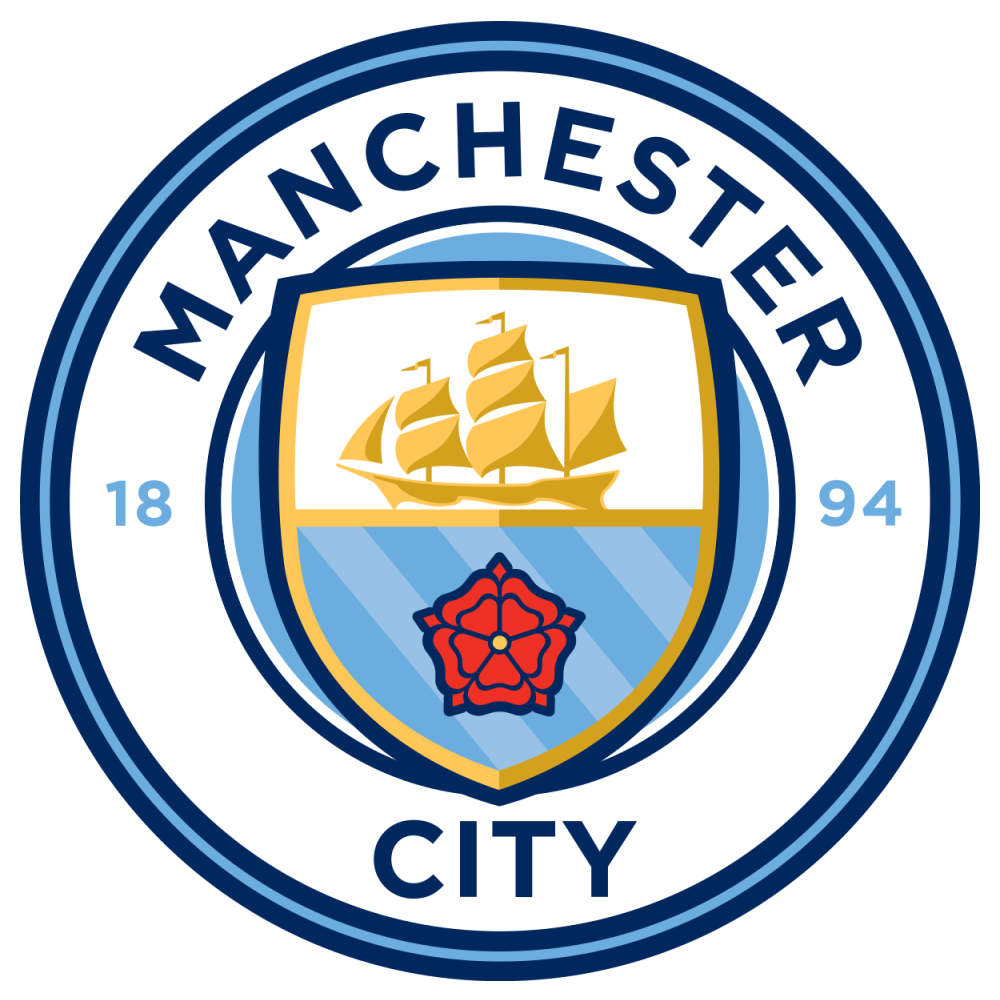
Manchester City
Bournemouth
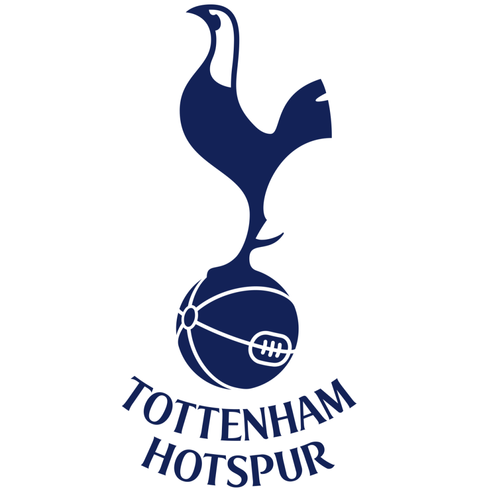
Tottenham Hotspur
Everton
Watford
First and foremost, City and West Ham have some of the most recent badges on the list and they consequently commit the crime of looking as though they've been soullessly drawn on Microsoft Paint.
As far as Bournemouth is concerned, it looks like a football has been kicked at someone's head mid-haircut and Watford is never going to rank highly as long as that moose is plastered all over it.
The Tottenham cockerel is pretty iconic, but it's awkward shape really makes it stick out like a sore thumb and looked far better when it was surrounded by a shield on the 2017/18 home kit.
Everton was the closest to moving up to the next tier; it just seems a step backwards from the livelier yellow-bordered design from the early 2000s and could do without the wordy, latin motto.
Easy on the eye
Leicester City
Southampton
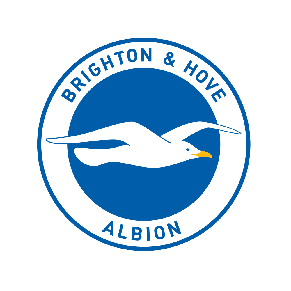
Brighton & Hove Albion
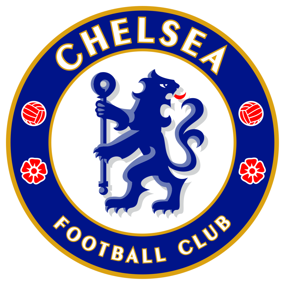
Chelsea
Crystal Palace
Aston Villa
Leicester have one of the tidiest badges in the division with their club name marrying nicely to the circular outline, while the brightly-coloured fox really leaps out from the Yorkshire white rose.
The tacky-looking tree aside, there's also nothing to hate about the Southampton badge with its beautiful collision of a club scarf, football and halo.
Brighton have played it really simple, but to great effect with its blue and white uniformity, while there's something brilliantly dramatic about the landing eagle on Palace's badge, despite making for an untidy outline.
The neat arrangement at Villa is only held back by the strangely-drawn lion and Chelsea's superb badge nearly reached the next tier if it wasn't for the red footballs adding one colour too many.
Gorgeous
Sheffield United
Arsenal
Liverpool
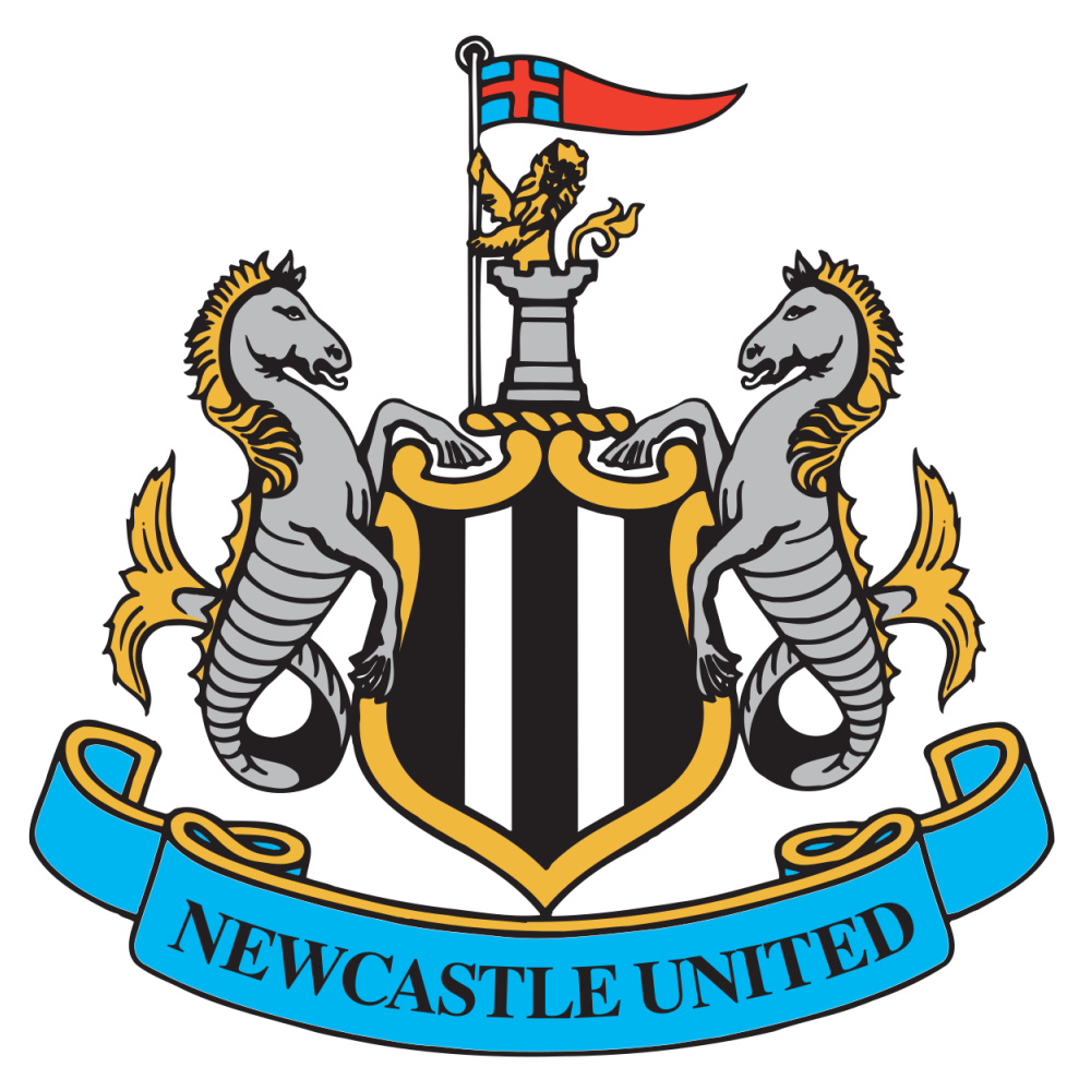
Newcastle United
There's just something epic about two crossed swords below a Yorkshire rose on the Sheffield United badge and the red bordering really makes their back and white designs leap off the kit.
Arsenal also deserve props for keeping it simple, using a lovely 3D effect with the shades of red to create the clearest imagery of a shield on which to highlight the famous cannon and club name.
And we've just got to tip our hat to Liverpool's crest for emoting the history and tradition of the club to such a degree with nods to the city's culture and the architecture of Anfield.
Finally, Newcastle drips class with one of the world's most recognisable badges, perfectly balancing the potential chaos of two seahorses, a shield and castle turret with knight all featuring.
Simply beautiful
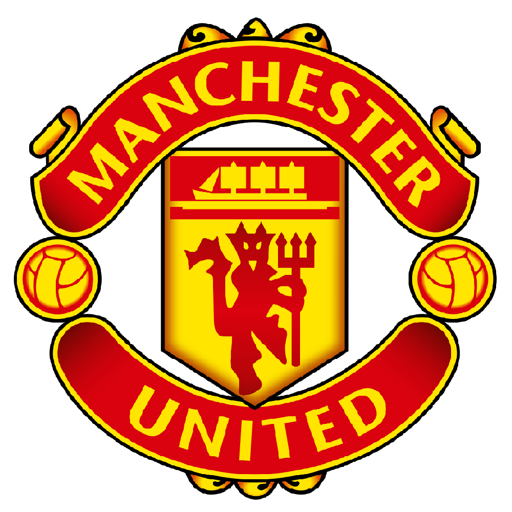
Manchester United
Wolverhampton Wanderers
United's is just stunning, isn't it? The red and gold shimmer off the badge with their eye-grabbing mix, the devil and boat are sketched with sharp straight lines and the text cards give a unique twist on circular outlines.
But Wolves might just take the title for completely epitomising 'less is more' with their incorporation of orange and black with a wolf illustration that couldn't possibly look anymore badass.
Full ranking
A mixed bag of badges
We know, we know, we've probably offended most Premier League fans here and it goes without saying that only a couple of badges are actually that bad.
What matters most is that these designs emote the memories and traditions of institutions that have united local communities, bringing them together for the beautiful game.
That being said, Wolves' predatory badge certainly strikes more fear than the explosion of iconography that took place on Burnley's crest.