


Kits are changed every season, but the crest printed on the front is rarely altered.
A crest is the focal point of any football club’s identity and symbolises the traditions, values and success of a team from its inception to the present day.
Football crests are among some of the oldest emblems of any sporting clubs in the world, so it’s no wonder how much they still mean today.
Although most crests are designed to encapsulate the history of a club, not all are created equal in terms of aesthetic pleasure.
So, in an effort to determine the most ‘beautiful’ crest in world football, Spanish publication Marca conducted a poll which attracted over 14 million votes.
Here are the top 25…
25 | Arsenal | 11.4k

The Gunners’ simple but imposing design kicks things off.
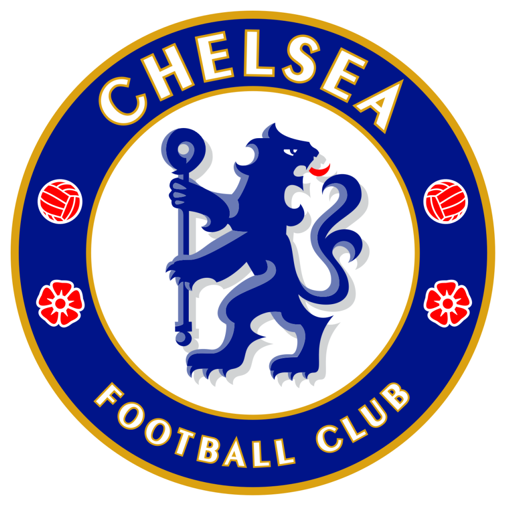
24 | Chelsea | 12.6k

The blue section of London polled narrowly better with the crest they’ve worn since their centenary year in 2005.
23 | Benfica | 12.6k

Benfica and the instantly recognisable eagle atop their crest come in next as the first non-English club.
22 | AC Milan | 14k

A true classic - it’s somewhat surprising that the Rossoneri don’t rank higher.
21 | Atletico Madrid | 15k

Featuring the Madrid coat of arms - a bear stretching to a strawberry tree - and their famous red and white stripes, the Atleti crest is certainly unique.
20 | Inter Milan | 15.9k

The Nerazzurri will take any victory over their city rivals, and their revised 2014 logo sees them come out on top in this survey.
19 | Estrella Roja | 16.7k

The Venezuelan may only have been founded in 2004, but their crest has already attracted plenty of admirers.
18 | AS Roma | 17.5k

Illustrating the myth of the founding of Rome through a female wolf and its two whelps, the capital-based club is the best-ranked team from Italy.
17 | Valencia | 18k

Based heavily around the coat of arms of its home city, Valencia’s crest has to be one of the most distinctive in world football.
16 | Ajax | 21.4k

Few football crests incorporate a person, but it’s impossible to imagine the Ajax logo looking any other way.
15 | Celtic | 24.1k

Celtic’s four-led clover perfectly accompanies the green and white hoops of the club’s home kit.
14 | Galatasaray | 25k

Despite simply being the first two Arabic letters of ‘Galata’ and ‘Saray’, the Turkish club’s badge really catches the eye.
13 | Wydad Casablanca | 27.5k

Possibly the most left inclusion of these 25 clubs, the Moroccan club wasn’t too far adrift of cracking the top ten.
12 | Yokohama Marinos | 27.6k

The Marinos were founded as the company team of Nissan in 1972 and despite becoming part of the City Football Group in 2014, they’ve rightly chosen not to change their emblem.
11 | Manchester United | 29.7k

The Red Devils usually fare well in this kind of vote due to their global popularity, but their famous crest doesn’t even pull enough votes to get them into the top ten.
10 | Besiktas | 34.4k

The Turkish giants’ logo has barely changed since 1903 and it’s still a hit with football fans to this day.
9 | CSKA Moscow | 42.9k

CSKA might be behind Spartak Moscow as the biggest Russian club in terms of league titles won, but it seems their emblem is the more popular among football fans in general.
8 | Colo Colo | 66.8k

The centrepiece of Colo Colo’s badge is a Mapuche chieftain of the same name - a crucial figure in the Arauco War against the Spanish empire during the 1560s. Not many clubs can boast such a deep connection to their location.
7 | FC Barcelona | 74.9k

The Blaugrana crest places a huge emphasis on the club’s connection to Catalonia in a stunning combination of red, blue and gold.
6 | Liverpool | 75.9k

Some might think it’s overly complicated, but any design that includes the famous words ‘You’ll Never Walk Alone’ is always going to be a winner.
5 | Fenerbahce | 76.4k

Largely unchanged since 1907, the Fenerbache emblem represents several core values of the club, including purity, open-heartedness, love, nobility and the envy of other fans towards them.
4 | Real Madrid | 134.2k

Another instantly recognisable brand, the Real Madrid badge has undergone only minor alterations throughout their glittering history. Why change anything when you’re winning?
3 | Fluminense | 169.2k

The existence of the Big 12 in Brazilian football is wholly justified based on their intense rivalry, and while Fluminense is one of the smaller members of that elite group, at least they can say their emblem is the most popular.
2 | Al Ahly | 3 million

You could be forgiven for thinking bigger clubs would’ve run away with this competition, but when you look at Al Ahly’s crest, you can see why the Egyptians have punched above their weight.
1 | Raja Casablanca | 3.5 million

Even if you’ve never heard of Raja Casablanca, you likely won’t be forgetting their crest any time soon.
It’s a beautifully proportioned combination of Arabic and English text, along with an eagle that provides the ideal focal point without dominating the other components of the design.