


The Premier League season is a little more than two weeks away.
We don’t blame you if you had to double-check your calendar to make sure we weren’t lying.
In fact, it was exactly one month ago that the Premier League finished on July 26.
This Saturday, Liverpool and Arsenal will go head-to-head in the official curtain raiser - the Community Shield.
While they obviously won’t both be wearing their new red home kits at Wembley, the two clubs do boast some of the nicest jerseys ahead of the 2020/21 season.
But what about the other clubs?
Well, we decided to rank every Premier League club’s new home shirt ahead of the new campaign.
Well, we say ‘every’ but one club hasn’t revealed theirs yet…
20 | Fulham
Fulham have taken the ridiculous step to hold back the release of their new kit until the first day of the season. As a result, we’re putting them in last place for just being different. Below is a concept kit which is absolutely gorgeous but not what the actual shirt is going to look like.

19 | West Brom
We’re not having this. The stripes are unsymmetrical and, if the blue was black, could be mistaken for a barcode. Then there’s the ‘Ideal Boilers’ sponsor which is probably the worst in the Premier League.

18 | Newcastle
We know Puma can’t really do too much with white and black stripes but this is just so boring. That bright blue ‘FUN88’ logo is pretty ghastly, too.

17 | Burnley
This kit is apparently inspired from the kit worn during the 1920/21 season where Burnley won the league and went unbeaten for 30 matches. That doesn’t mean we like it, though. The blue sleeves start a bit lower down the arm than they should - something that featured on the kit 100 years ago. Meanwhile, it looks as though the collar has been ripped.

16 | Southampton
Under Armour has marked Southampton’s 135th anniversary with a throwback to the club’s iconic sash kit first worn back in 1885.
But we think the sash should stay in 1885. It has no place in 2020. Unless it’s the Peru shirt, a sash should be banned.

15 | Tottenham
Tottenham’s new kit is made from recycled bottles. You couldn’t make it up, could you? Jokes aside, their new home shirt is nice.
Constructive feedback: we don’t really like the yellow - it’s not needed. And the blue shoulders don’t look great looking front on.

14 | Leeds
It’s been a long time coming - a Leeds United Premier League kit. Not only that but they’ve moved from Kappa to Adidas. It was always going to fly off the shelves in Leeds’ official store no matter what it looked like.

13 | Chelsea
We saw Chelsea wear their new kit at the end of the 2019/20 season and much has been made of the giant ‘3’ in the middle of the shirt. It looks pretty rubbish, in truth. We enjoy the little pattern they’ve got going on and the black trim beats having a white trim.

12 | Leicester
First thing’s first - the sponsor. Leicester have teamed up with Tourism Authority of Thailand and have ‘Thailand Smiles With You’ written across their shirts. It’s just a bit much. Then there’s the V-neck collar which is a bit suspect. The gold trim looks as though they’re trying to remind everyone they won the Premier League title once.

11 | Crystal Palace
Let’s ignore the fact that all three of Crystal Palace’s shirt feature the exact same design just in different colours…
Taking the home kit in isolation, Puma have done a pretty decent job. However, there are a couple of aspects that we’re not entirely sure about. Why doesn’t the middle stripe go to the top of the shirt? It looks a bit weird just ending at the chest. Then, the yellow ‘W88’ logo ruins the red, white and blue colour scheme. Remove that logo and just keep the ‘W88’ then it would look pretty decent.

10 | Everton
Everton have swapped Umbro with Hummel and it’s always nice to have different brands coming up with different kits in the Premier League. We love the shade of blue and the traditional Hummel stripes on the shoulders. We’re not big fans of the ‘Cazoo’ sponsor though as it’s a bit too impeding.

9 | Sheffield United
It’s nice but we just feel there’s a little *too* much black on the top half. The v-neck collar is a little too thick. The stripes to all the way to the neck (take note Crystal Palace) and the logo blends in nicely. The red and black on the sleeve is smart.

8 | Aston Villa
We’re really enjoying the dark pinstripes down the shirt. While the shirt sponsor of ‘Cazoo’ is a little too big for our liking, the font actually looks quite nice. We’re not quite sure that the entire sleeves are a different colour making it look a bit vest-like.

7 | Manchester City
The pattern on City’s shirt is apparently inspired by the iconic mosaics located in the creative hub of Manchester’s Northern Quarter, which is a nice touch. It beats having just a boring, plain sky blue strip.

6 | Brighton
Brighton have ditched the stripes and, instead, gone for pinstripes. It’s different but we reckon it looks pretty smart. The trim of yellow in the Nike tick and on the side of the shirt is a nice touch. We’re not entirely sure on the collar, though.

5 | Manchester United
Adidas risked making United’s shirt looking like a bus seat with those gold and black lines on the jersey. But they’re subtle enough and actually look decent. The famous three white stripes on the shoulders feature, while the club crest has returned to red and gold.

4 | Wolves
We like the darker shade of black but we’re just not too sure on the pattern. It appears to be arrows pointing down towards the groin area. An interesting choice.

3 | West Ham
It’s a 125-year anniversary special for West Ham and Umbro have made it look old school and simple. And we rate it. The shade of claret and blue is easy on the eye and the large badge does it for us. We’re fans.

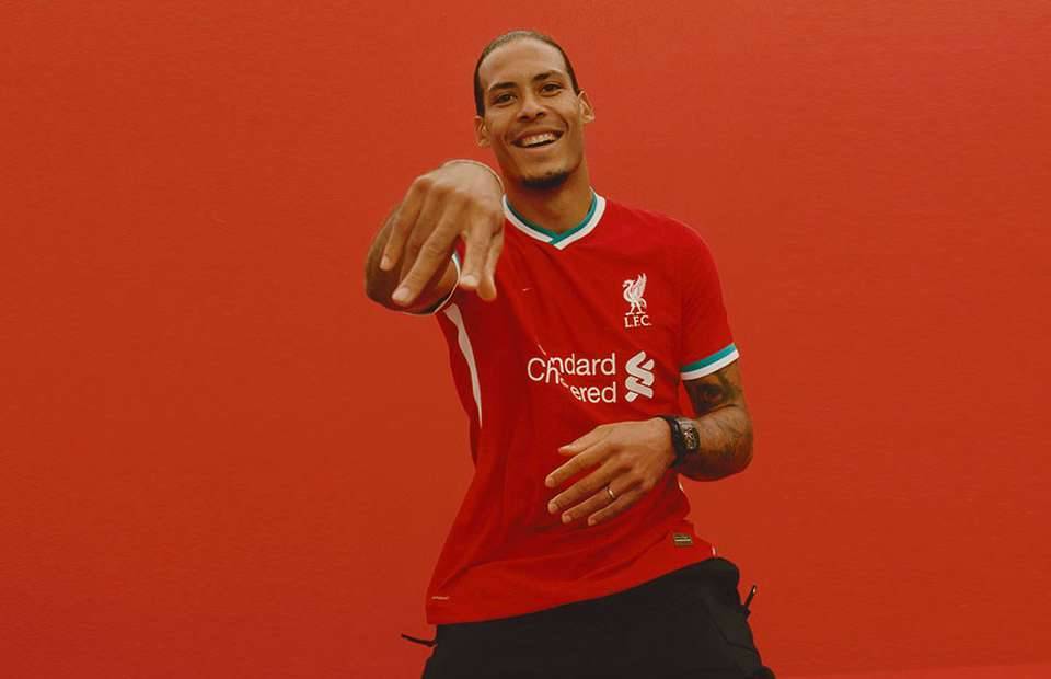
2 | Liverpool
Liverpool + Nike = Dream Team. The shade of red is slightly lighter than New Balance’s latest effort and we absolutely love the green and white trim. A kit fit for champions.

1 | Arsenal
Adidas have done it again for the Gunners. In fact, they might have gone even better than last season. We love the funky pattern that gives it a retro vibe with the different shades of red. The trademark white sleeves look beautiful, while the ‘Emirates Fly Better’ sponsor is subtle enough.
