


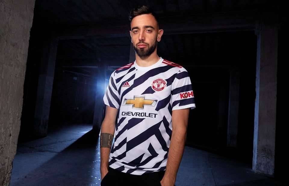
Manchester United have released their third kit for the 2020/21 season and to say it’s sparked a reaction would be an understatement.
The kit comes with a bold dazzle camo design, with black and white diagonal stripes covering the front of the shirt.
It didn’t take long for the jokes to start.
“People will use it to cross the road,” one fan on social media wrote.
According to The Athletic, Adidas spent two years designing the kit.

The kit manufacturer say it “provide a fresh update to tradition while delivering a vibrant new print”.
Ole Gunnar Solskjaer’s players will stand out while wearing it, that’s for sure.
Ranking Man United's recent third kits
But how does it stack up compared to the club’s most recent third kits?
We’ve decided to rank their eight entries since 2010/11 from worst to best.
8. 2015/16
Did Adidas not realise black and orange doesn’t go until after they made this one?
The brash orange crest with the black text really doesn’t look good. A really, really poor shirt.

7. 2016/17
We’re not overly keen on this one.
It feels like Adidas realised the kit was too plain and decided to add a hexagonal pattern to the sleeves.
But it’s makes for a messy aesthetic, quite frankly.

6. 2014/15
Front on, this isn’t such a bad look. The collar is neat and Nike opted for a nice shade of blue.
But it’s the orange stripes that runs down the side of the shirt and across the shoulder that lets this one down. Without them, this could have been a solid design.

5. 2018/19
The dark navy and gold meshes nicely on this one.
It’s made from recycled ocean plastic, too, with Adidas keen to highlight the issue of marine pollution. A nice touch.

4. 2019/20
Adidas came through with a tasty design that featured a subtle rose pattern on the front.
The orange crest wasn’t nearly as much of an eyesore as it was in 2015/16.

3. 2017/18
A sleek shirt that features the United Trinity on the front. What’s not to like?
The light grey looks really nice and Adidas were smart to go with white for their logo and three stripes on the shoulder.

2. 2010/11
Nike’s unique look for Man United’s 2010/11 third kit - which was also the design for their away shirt the season before - was superb.
The blue chevron across the front suits the black shirt so well.

1. 2020/21
Yes, we’re absolutely doing it.
The black and white dazzle camo look works so well with the red trimmings, leading to a bold uniform that we really like.

The reaction on social media suggests that we’re in the minority on this one, but we’re ready to put it No.1.
Maybe seeing David Beckham sporting it will change some minds.
