


It's Premier League day, ladies and gentlemen.
The wait for England's top division to restart might have been shorter than ever, but nothing compares to the feeling of having an entire eight months of footballing action ahead of you.
It will be fascinating to see whether Liverpool can retain their title, Manchester City or Chelsea can challenge them and if Leeds United, West Bromwich Albion and Fulham can dodge the drop.
New Premier League kits
But there has been one way in which we've been able to order, rank and compare the teams in the meantime and that's through the jerseys they've released for the 2020/21 campaign.
In the case of teams like Chelsea, we actually got to see some of these new strips on a regular basis at the back end of last season, but all of them will be on show from this weekend onwards.
Here at GIVEMESPORT, we love pitting Premier League kits up against each other and we already put the 20 home kits to task a couple of weeks ago.

All 20 away kits released
If you were then wondering where our away kit edition had gotten lost along the way, it's because we were waiting right until the penultimate day until Burnley finally released their alternate strip.
But now that the team at Turf Moor have finally hung their away jersey on the rails, it's time for us to rank all 20 of them from the worst looking to the finest in the land.
You can check out our final selections down below to see where you team placed:

20. Wolverhampton Wanderers
Oh dear god. My eyes. My eyes.
Seldom has there been such a divisive kit in the Premier League over the last few years and if there's one thing that I can't criticise Adidas for here, it's originality and rule-breaking.
I think everybody has made the point that the blue patterning should have been added to the shoulders, too, but even that would just be making the best out of a bad situation.
Look, credit to Adidas, because this kit will be talked about and looked back upon for years to come, which might well have been the point, but that doesn't make it less of an eyesore.

19. Fulham
Yeh, Fulham, we get it, you're back in the Premier League, you didn't have to release an away jersey brighter than the sun to remind us all.
Simply put, the shade of yellow used here is absolutely horrible and the uninspiring shoulder dots remind us of some old pop-art, vintage Sprite cans or that terrible Liverpool kit from the mid-2000s.

18. West Bromwich Albion
Again, credit to West Brom for having good reason for the whole barcode design, tipping their hat to the 1992/93 promotion season, but their away and third kits are particularly horrendous.
Whoever decided that green and yellow would be a good colour combination to wash out this self-checkout nightmare really dropped the ball.
It's made to look even worse for the fact WBA's iconic badge is flooded with the Norwich-esque palette, too, while the 'Ideal Boilers' sponsor adds an unideal boil of a red dot to the mess.

17. Southampton
We're sure the Saints have good reason for collaborating with the sponsors that they did, but LD Sports have, without a doubt, the most egregious-looking logo to slap all over a jersey.
Aside from the absolute life story both drawn and written across the centre, I'm also not a fan of the lurid hues of blue and yellow that pale in comparison to the sashed home and third releases.

16. Aston Villa
Right, ok, we're out of the woods because it goes without saying that the gap between 16th and 17th place is pretty substantial and this Villa kit actually has its fair share of admirers.
Nevertheless, there's something about the smartness of the black with claret pinstripes that's completely curtailed by the obnoxious use of blue, especially on the in-your-face Cazoo logo.
The messy collar is what truly pushes this strip down the list, though, with that singular button looking completely arbitrary and ruining any chances of the design looking smart.

15. Arsenal
A little like the West Brom effort, you've got to applaud the nod to the club's history and Adidas were always going to pull on heartstrings by reminding Arsenal fans of Highbury's marble halls.
However, there's a good reason why marble looks good on kitchen worktops and is seldom seen as the basis for fashion, so it should come as no surprise that this design is completely held back by its concept.
I actually think it looks just about as perfect as a marble-inspired kit could possibly do, albeit vaguely resembling blood spatters, but that's not enough to raise it up from 15th in my eyes.

14. Crystal Palace
It's been well publicised that Palace essentially synchronised their three kit releases with these finite vertical stripes, but the worst of the bunch is undoubtedly the away strip.
There's something about the bright red being placed on a white background that makes it stand out uncomfortably to the point it, erm, looks a little bit phallic. I bet you can't unsee that now.

13. Newcastle United
There's actually a lot to like about Newcastle's away kit from the unique and subtle texturing to the stunning neckline to the brilliant shoulder padding and even the one-button collar looks fine.
So why is it only in 13th? The colour. I'm not sure I need to explain why this otherwise decent kit has been completely side-swiped by a pale, anaemic custard bleeding into the iconic badge.

12. Tottenham Hotspur
Speaking of colours, Tottenham have one of the best range of kits in the Premier League this season and there are absolutely zero things to complain about in terms of Nike's template.
But quite why they decided to base the jersey on this murky, muddy green colour is beyond us and we need to see it on the pitch ASAP in order to hide that terrible pink lining in the collar.

11. Sheffield United
You're always dicing with death when you release a pink kit, but there's undoubtedly a roadmap for getting it spot on and you only need to look at Leicester's away strip last season to see it.
And for the most part, the Blades have comfortably bumped themselves into mid-table with an inoffensive shade of pink that is soundly organised by Adidas' classic striped template.
That being said, we're not a fan of the strange, spilt-yoghurt texturing that can be seen around the badge and there just happens to be at last 10 more kits that bring a little more personality.

10. Everton
Meh, you know? Although the yellow is a little bit mustardy for my liking, it doesn't border on offensive like Newcastle's does and Hummel are one of the safest pair of hands in the kit business.
The classic arrows on the shoulders are always a nice touch, albeit a little uninventive, while we dare say the Cazoo sponsor blends in just as well as the club badge. It's, yeh, just kind of fine.

9. Chelsea
There is part of me that wants to agree with everyone calling this a pyjama top and trust me, ninth place is hardly me bowing down to the throne of Nike, but it's just kind of middle of the road.
While I'm not really struck on the metallic-looking etchings nor the gargantuan '3' logo, the negatives are balanced out by the smart colour scheme and one of the league's best collars.

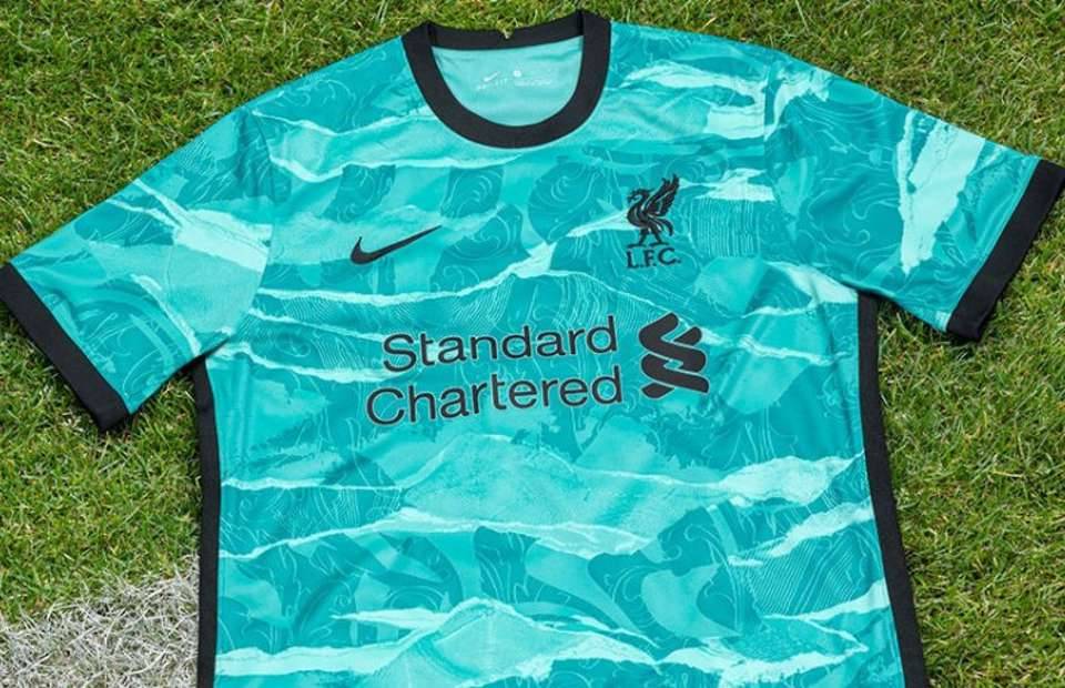
8. Liverpool
I've written tonnes and tonnes of kit articles in my time, but I'm not sure one jersey has ever continually changed in my estimations as much as Nike's swirling away design for Liverpool.
To tell you the truth, there's times when I consider it to be the worst in the league - aside from Wolves, of course - but then there are times when I think it should be worthy of a top-three place.
So, it only seemed fair that I placed it roundabout in the middle and as much as the whacko colour pattern looses me sometimes, credit to Nike for making so many nods to Liverpudlian culture.

7. Burnley
Having made me wait until the actual day of the new Premier League season to write this ranking, I would have been raging if Burnley had dropped an absolute eyesore at the last possible moment.
However, credit to them, because the extra time they spent in the studio clearly paid off and they've found the key to my heart with the theory that you can't go wrong with a black away kit.
The gorgeous claret and blue collar, tidy shoulder trimming and inspired incorporation of their old club badge are enough for me to overlook one of the loudest sponsor logos in the division.

6. Manchester United
Considering United's home kit looks like a bus seat, it's pretty remarkable that Bruno Fernandes literally sitting on a bus seat wearing the away jersey doesn't bring back terrible memories.
And as much as I want to penalise Adidas for not really showing that much originality, the swanky combination of their classic three-stripe template and the beautiful texturing is too good not to reward.
They've also not fallen into the trap of recent years of going too left-field with their predominant colour as the ‘legend earth green’ has enough grey in it to surpass last season's 'snake skin'.

5. Leicester City
Call it boring if you please, but we like to call it smart. Adidas have knocked it out of the park with a welcome twist on their classic template by allowing this clean, white shade to take centre stage.
The gorgeous paint-brush texturing elevates it into the God tier of 2019/20 kits, while the sponsor is far more simple compared to the home strip and we adore the blue stripes down the side.

4. West Ham United
Aston Villa and Burnley need to raise their kit game when you consider West Ham are on a remarkable batting streak with their claret and blue colour palette.
Credit to Umbro because they've continued their run of stunning Hammers jerseys with a beautifully simple incorporation of the classic colours that marry perfectly with the alternate badge.
The horizontal stripes, aside from being downright perfect, even goes as far as mitigating the bold and black 'Betway' sponsor that could easily have ruined lesser kit designs.

3. Leeds United
If you took these hues in isolation, you'd be forgiven for thinking Leeds had dropped an absolute clanger, but this homage to the 1990s is perfect for their long-awaited return to the top flight.
Aside from bringing back heyday memories of Tony Yeboah tearing up the Premier League, the green and blue stripes shake hands seamlessly and Adidas' golden shoulder stripes are simply stunning.
Our only knit-pick is that the sponsor, albeit largely coordinated with the colours, seems to hurdle a little uncomfortably over the stripes.

2. Manchester City
City's 2020/21 jerseys have been absolutely wild and although all three releases have their fans, I'm personally a little nonplussed by their mosaic home strip and wild-patterned third shirt.
However, Puma really found the sweet spot with an away kit that features highly on many people's rankings, beautifully paying homage to the architecture in Manchester's Castleford area.
You can't go wrong with a predominantly-black colour scheme and the trimmings use a brown shade that should be terrible, but actually brings a real harmony to the juggling act of logos.

1. Brighton & Hove Albion
Boom. In this writer's humble opinion, it doesn't get much better than Brighton's gorgeous blend of yellow and blue, which compliments the club badge and sponsors for an incredibly clean look.
I was in the minority of fans that thought Nike's vintage collar design didn't work too well on some of their 2019/19 third kits but, for whatever reason, it looks bang on the money with this release.
The collars and sleeves are rounded off beautifully with the bright blue of the club and the subtle, diagonal-striped texturing places the cherry on Nike and Brighton's cake.

A mixed bag of kits
And breathe. Look, ranking and judging football kits is completely subjective and trust me, I'm more than aware that plenty of fans think the new Wolves away jersey is absolutely stunning.
To be fair, I've got to commend Adidas for resisting the temptation to release a paint-by-numbers alternate strip and just decided to throw the rulebook out the window before making a start.
But hey, personally, I'd take the 19 others kit over it any day of the week and if that makes me the most boring person on the internet, then that's the price I'm willing to pay.
