


The 2020/21 Premier League season is officially underway.
Barely half of the teams have kicked a ball, but just two days of action has been enough to get us excited for the next eight months of thrills and spills at either end of the table.
It's already been gripping to see Liverpool begin their title defence with a 4-3 win over Leeds, while Arsenal and Everton impressed with three points at Fulham and Tottenham respectively.
2020/21 Premier League
The season getting underway also meant that clubs had to complete their kit announcements with Fulham and Burnley amongst the clubs to release 2020/21 designs at the last minute.
And as much as changing jerseys every season might make the subtle changes feel arbitrary, the subtle fashion nuisances could forever be associated with the club if it's a memorable year.
But as is the case with every season, there's been as many as design disasters as there has been superb templates for 2020/21 and the fashion police have been quick to arrive on the scene.

Kit designs seemingly finalised
Here at GIVEMESPORT, we've already ranked every home and away shirt in the Premier League, but modern football being modern football, there are also third kits to be considered.
The football purists within us want to tip our hats to the seven clubs who haven't released an alternate jersey this season, though we can't deny that third shirts are often the most interesting.
Because they're only sported on rare occasions, sports companies seem to throw the rule book out the window and go for truly whacky designs, which is exactly what has happened in 2020.

Ranking Premier League third kits
So, without further ado, we've come to wrap up our Premier League kit rankings for the season by sifting through the good, the bad and the ugly of the 2020/21 third jerseys - check it out:
Note: We are not including clubs, like Brighton & Hove Albion, who are recycling away kits from previous seasons as their back-up jerseys. New kits only here.

13. West Bromwich Albion
Look, I'm sorry Baggies fans, I feel as though I've spent half of my summer bashing your kits and trust me when I say paying homage to the 1992/93 promotion-winning season is a nice touch.
But your third kit is the worst design out of a terrible trio of with the barcode template essentially looking as though it's been drowned in a vat of spaghetti hoops. Deservedly rock bottom.

12. Newcastle United
For starters, it speaks volume that I included Newcastle's third kit in my ranking of the worst 2020/21 shirts recently and it hasn't grown on me one iota since that day.
As much as I admire the creativity, I stand by my assessment of it looking like somebody has dropped a bag of Doritos into a puddle of petrol and as for that shade of yellow... sheesh.

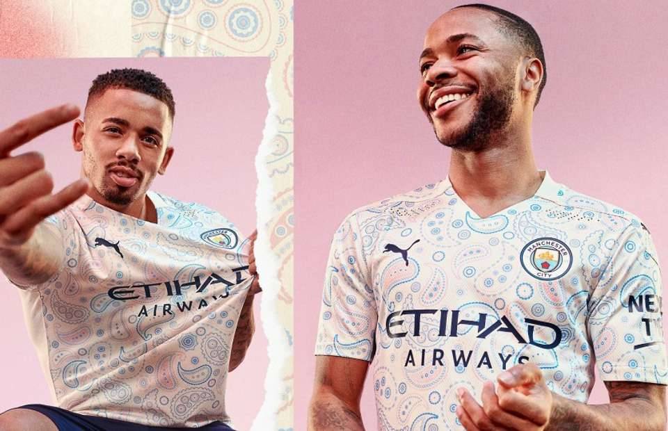
11. Manchester City
Fair play to Puma because this completely left-field design, albeit one that nods its head to Manchester's fashion culture, has won over a surprising amount of admirers.
Nevertheless, I'm shamelessly amongst the brigade of fans thinking that it looks like a grandma's curtains and the anaemic shades of pink do little to brighten up the hideous patterning.

10. Everton
The colour. The colour. That damn colour.
The template is fine, so is the variant of the club badge and even the massive Cazoo sponsor isn't too obnoxious, but whoever thought this minty green was a good idea for a football kit was badly mistaken.

9. Leicester City
Speaking of dodgy colours, you're on a hiding to nothing washing out a football kit with anything vaguely resembling brown and for whatever reason, we think it kind of looks like a training top.
It probably has something to do with the unnecessary white panelling on the underarms and everything that can be said about the 'Thailand Smiles With You' logo has already been said.

8. Crystal Palace
Palace's three kits are much of a muchness this season with one being primarily blue and the others being white and black but for me, only the home strip doesn't look an explosion at Dulux factory.
As much as there's not too much to hate here, there's just too many colours going on with the blue, black, gold and red, while the middle stripe is made to look like, well, you know what I mean.

7. Tottenham Hotspur
I'll be completely honest with you here, I was buzzing to see this kit released when I saw some of the initial leaks because I think the collar is incredibly smart and the central Nike tick is supremely classy.
However, I can't help sending this tumbling down the list for having a far more pungent shade of yellow, bordering on a stomach-churning orange at the bottom, than the first snaps suggested.

6. Arsenal
There's a lot to like about this Arsenal shirt, no doubt about it, with Adidas continuing their golden streak in north London and there's a massive gap between seventh and sixth place in terms of quality.
We just wish that a more aesthetic hue than this strange pink was used for the trimmings, which should have been added to the collar, because it really dampens the stunning aqua camo.

5. Manchester United
Imagine the scenes: you're crossing the road when you think you have right of way, only to look down and see that you're not on a zebra crossing but Paul Pogba and Anthony Martial's chest.
Yup, we're shamelessly in the camp of people that think Adidas managed to pull off this barking mad design pretty well with the lovely red template tidying up the crazy zebra-like texturing.
As long as they don't make the shorts black and white, too, we're happy to include it in our top five.

4. Southampton
Why on earth isn't this their away kit? To say this sashed design, which beautifully reflects the home shirt, blows the Saints' actual away release out of the water is a huge understatement.
It's sad to think this absolute eye-candy of a red and white collision won't be donned as much as their weaker alternative kit and it's only the messy sponsor that holds this back from a top three place.

3. Chelsea
Yup, sue me, I'm not offended by Chelsea essentially ripping off their London neighbours Crystal Palace with a strip that, well, looks like it doesn't belong to them.
Trust me when I say my mind wants to resist liking this design, but there's something so brilliant about the red and white stripes being so light and then fading away into the bottom of the torso.
I don't even mind the huge '3' logo on this particular design and if nothing else, it completely shows up Nike's home and away releases for being a little less on the boring side.

2. West Ham United
This is proof that sometimes keeping things simple is the way forward and I've always been upfront on these ranking articles that black alternate strips are the key to my heart.
Black and gold has always been a colour combination made in heaven and when you combine that with all the logos being coordinated, as well as a stunning collar, you have one of the Premier League's finest tops.

1. Liverpool
There was so much excitement about New Balance passing the torch to Nike this summer but, to tell you truth, the sporting giants didn't really get it spot on for the Reds until this gorgeous third kit.
The black and red mix so seamlessly, the graph-like texturing isn't too in your face, the touch of white on the collar is distinctly Liverpool and the logos rest effortlessly on top of the patterning.
The home kit was solid, the away kit keeps changing in our estimations, but Nike really took the Premier League to task with a brilliant third strip that we hope gets plenty of airtime.

GIVEMESPORT's Kobe Tong says
I tell you what, this might be the whackiest collection of Premier League shirts I've ever seen.
I can't have been alone in thinking 'surely not?' when the first images leaked of United and City's designs emerged, though I have to say that the red side of Manchester seemed to stick the landing.
But I know I'm probably alone in thinking so with countless memes comparing United players to zebras, as well as their respective pedestrian crossings, across social media.
As for my victorious kit, I've not seen as much hype surrounding Liverpool's final release as I thought I would, which is pretty surprising when I consider it to be Nike's best design for the champions.

Sure, it's inevitably going to draw 'chessboard' jibes, but I'm inclined to think the mixture of grey, black and red perfectly rides the line of being original while still keeping things pretty simple.
Then again, this is coming from the bloke who thinks Chelsea essentially releasing a Palace jersey was actually pretty decent, so who am I to judge?