


England are just a few days away from kicking off at Euro 2020.
It's been a long wait, but fans around the country can start preparing for a summer of footballing festivities that could - if you dream really hard - see the Three Lions become kings of Europe.
And if England's 2021 achievements are destined to go down in the history books, then you can rest assured that the kits they wear will be engrained in the memories of fans for decades to come.
England's iconic kits
Besides, you only have to look at the enduring legacy of England's grey kit at Euro 96 or the classic red strip at the 1966 World Cup to see just how iconic sporting jerseys can really be.
However, iconic or not, there's no getting away from the fact that some England kits are far better than others and we've set ourselves the task of ranking every single on from worst to best.
According to the Mirror in 2018, the total number of England jerseys stood at 41 with the ultimately plain white and red home and away kits before 1974 being rolled into one for argument's sake.
Solskjaer has Trippier BID rejected (Football Terrace)
Ranking every England kit in history
Since then, England have brought out three more jerseys - two of which will be worn at Euro 2020 - and they appeared to miss the 2016/17 home and away kits, so our total actually comes to 46.
Now, it goes without saying that judging kits is massively subjective and this is only our opinion, which is no more or less legitimate than yours, so don't hate us too much if your favourite ranks on the low side.
[gmsStartingEleven url="https://givemesport.starting11.co.uk/2020-09-05/"]
But enough housekeeping and disclaimers, let's put the long and decorated history of England kits to the test, so check out our ultimate ranking of Three Lions jerseys down below:
46. 2007-2009 Away
Nope. For whatever reason, this jersey has always resembled more of a training top than a world-class away jersey and is arguably the cheapest that an England kit has ever looked.

45. 2020- Away
The throwback to a light blue away kit should have been a triumph, but the texturing looks like a shirt someone would wear at a festival and the red badge makes for a dreadful colour combination.

Euro 2020: News, Groups, Fixtures, Dates, Tickets, Odds And Everything You Need To Know
44. 2010-2011 Home
Fair play for trying something different but in this writer's humble opinion, the decision to insert mini, multi-coloured St. George's crosses on a weird shoulder pad makes for England's worst home strip.

43. 2016-17 home
However, it isn't England's worst home kit by miles and miles because the 2016/17 Nike template of blue-coloured shoulders has aged like unrefrigerated milk. Iceland fans probably love it, mind.

42. 1974-1980 Away
Admiral's England designs are so hit and miss for us. This long-serving away strip is most certainly in the latter camp, giving us both barrels in terms of looking cheap and messy.

41. 1988-89 Away
What happened with the collar?!

40. 1993 Third
An attempted encore for a shirt that - spoiler alert - places much higher on the list, but the bizarre and tacky lion texturing pulls the rug from underneath another decent-looking blue palette.

39. 2013-2014 Away
Don't mess with the badge. A little like the current away strip, there's something that gets under our skin when the iconic three lions are washed out and the gold look, albeit celebrating an anniversary, is lost on us.

38. 2016-17 away
At least combining two shades of red is less of an affront to fashion than the home kit, but we repeat: the 2016/17 Nike template is our least favourite of the modern era.

37. 1974-1980 Home
We didn't like the away strip and we don't think the home version is much better either. At least the white background makes it feel a little less chaotic.

36. 1984-1988 Away
Something just looks, well, off, doesn't it? We can't put our fingers on why this looks so poor in the long catalogue of red England kits, but we won't be rushing to track this down at a vintage store.

35. 2009-2010 Away
I'm sorry, but it looks too much like a fan t-shirt for our liking. Maybe a white, rounded collar like you see on the sleeves would have bumped this up a few places.

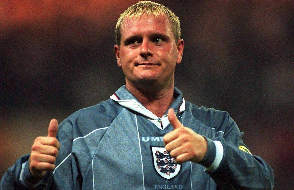
34. 1995-1996 Away
Here it is. The one you've all been waiting for. We wanted to place this higher, we really did, but we can't let its sheer iconic status take away from the fact that, well, it's not actually that good...

33. 1997-1999 Home
'Blasphemy', I hear you cry! This might be the clearest example of how subjective ranking kits really is because I'll probably offend millions of England fans by saying that this jersey is far too messy.

32. 1999-2001 Home
We're starting to get into vanilla, middle of the road territory here because there's not much to love nor hate about this round-necked design. It certainly didn't give us any luck at Euro 2000.

31. 2003-2005 Away
It's all a little 'meh'. The red background and gold star are impossible to hate, but the St George's cross inlays on the shoulders were certainly a design own goal.

30. 2005-2007 Home
It's just sort of alright, isn't it? The collar could do with some work, mind.

29. 1993-94 Home
Speaking of collars that need work, this hit-and-miss design should have been stripped of the mini England badge just as it should have been worn at the 1994 World Cup. If only, if only.

28. 1984-1988 Home
Speaking of collars that ne--- actually, no, because the collar on this strip is simply superb, but it's the pyjama-like stripes that levels out this iconic design in the middle of the pack.

27. 2009-2010 Home
Although it was universally loved at the time, England's 2010 World Cup number has gone down in everybody's estimations. It looks slightly more like a darts team's jersey than we'd prefer.

26. 2017-18 Away
We're torn on this one because there's no denying that it's a classy strip, but it looks absolutely nothing like an England kit and for better or for worse, we can't get our heads round that.

25. 1999-2001 Away
Yup, pretty decent, this. The navy trimmings on the red background are a lovely addition.

24. 2007-2009 Home
Not much to say here other than it's the 2006 World Cup design but with a welcome upgrade.

23. 2012-2013 Home
On the back of a home strip that embraced the royal blue, Umbro went all out with bright red for the next effort. Call us predictable but it works on the trimmings and collar, just not the iconic badge.

22. 2013-2014 Home
If there's any guarantee with simple England home shirts it's the fact that it will never rank near the bottom of people's lists, but it will never rank very highly either. That, and the fact it looks a little bit like a Germany strip...

21. 2011-2012 Away
Non-red England away kits are always dicing with death, but the mixture of a smart navy abdomen and the light-blue collar makes for a lovely, albeit uninspiring, colour combination.

20. 1980-1983 away
You know we said the Admiral England kits were hit and miss? The 1982 World Cup offerings were far better than their predecessors, even if we don't love this design as much as most England fans.

19. 1994-95 Away
Is the Merlot red a little strong for an England kit? More than likely, but it's our guilty pleasure design in the long history of Three Lions jerseys.

18. 2003-2005 Home
Yes, I really have ranked this much higher than the 1998 World Cup kit and yes, it might have something to do with the fact that David Beckham looks so darn gorgeous in it. I know no shame.

17. Pre-1974 Home
It's classic, it's iconic, it's eternally loved, but at the end of the day, we can't rank a plain white jersey too high on the list.

16. 2018-19 Home
Forever tearstained in my eyes because of that defeat to Croatia in Moscow, but of all the England shirts to play it completely straight-faced in all white, this one stands out as the smartest looking.

15. 2001-2003 Home
One hundred points for bringing back glorious memories of that night in Munich and the red stripe to the side is one of the finest design touches we've seen on a modern England shirt.

14. 1990-1993 Away
This template is god tier when it comes to England strips, we just happen to love it more when it's filled with white than red. More on that shortly...

13. 2014-2016 Home
A classy collar, the shiny effort that shimmered on the pitch, the beautiful blue trimmings and frankly, just the way it appeared to sit on the players when they wore it made this World Cup effort a classic.

12. 2001-2003 Away
We don't need to justify this selection beyond two points: just look at that collar and remember the scenes when David Beckham converted his penalty against Argentina. Magic.

11. 1987-1989 Home
While it might have brought nothing but misfortune at Euro 1988, we're massive fans of the collar and the only thing that made it look even better was Terry Blutcher's blood. Gosh, that sounds weird when written down...

10. 2005-2007 Away
Gold numbers and trimmings on a red England jersey is a massive positive when the badge isn't dipped into molten metal, too, so it's no wonder this shirt works a treat for my fashion senses.

9. 1995-1996 Home
There's something about England shirts that focus on blue trimmings that tends to look cheap to me, unless it's the Euro 96 jersey in which case I'm willing to rip up my rule book and bow down to its greatness.

8. 2018-2019 Away
Why, why, why, why couldn't this have remained our away kit all the way until Euro 2020?! It's one of England's most underrated away kits with the beautiful cross design blended into the abdomen.

7. Pre-1974 Away
We won the World Cup in this bad boy. Nuff said.

6. 1980-1983 Home
It's not for no reason that this little beauty is recycled into fakes and re-releases every ten seconds because the cascade of blue, red and white down the shoulders is nothing short of design genius.

5. 2014-2016 Away
Absolutely stunning. This feels like the best shade of red ever used on an England shirt and the simplicity really makes the three lions on the chest roar. Oh, and the template is also fantastic.

4. 2020- Home
Call it recency bias, call it overexcitement, but I have good reason to think that England's current home kit is the best of the 21st century with its stunning lion design on the collar and side stripes.

3. 1990-1993 Home
I mean, come on, it's the Italia 90 home shirt. Need I say anything more?

2. 1997-1999 Away
For all the messiness of its home shirt, Umbro knocked it out of the park with a gorgeous away strip that nailed the centralised badge, blended slick texturing and achieved design perfection with the collar.

1. 1990-1992 Third
It couldn't be anything else, could it? This absolute gem from the 'World In Motion' video is the ten-thousandth reminder that kits from the 1990s set the standard and this remains our England GOAT.

Which kit is your favourite?
And breathe. Give or take the suit-sized smocks of the Victorian era, we've pretty much talked you through every single jersey that the Three Lions have sported across their rollercoaster history.
In the end, despite the tradition of the white and red jerseys, it seems strange that a kaleidoscopic blue design from the early 1990s that was only ever worn once takes the prize.
Well, at least it does in our eyes, but it's by no means the definitive correct answer, so be sure to let us know your personal favourite in the England wardrobe across our social channels.