


Premier League badges are amongst some of the most recognisable logos in world sport.
Premier League badges
Within the confines of a small graphic and collection of symbols, football club badges have some extreme heavy lifting to do when it comes to both brand awareness and representing history.
And while each and every badge that will grace the Premier League 2021/22 season has its own special meaning to the fans, let's just say that some are more aesthetically pleasing than others.
Whether it's gorgeous simplicity, the perfect cocktail of symbolism or a dreamy distillation of the club's ethos, there are just some badges that stand out for getting the formula bang on the money.
Chelsea to bid £50m for Declan Rice (Football Terrace)
Which are the best looking?
So, yes, that's right, given that the internet age loves nothing more than ranking things, we couldn't resist staging an all-out contest between the latest cohort of Premier League iconography.
To do so, we're turning to our trusty method of 'Tiermaker' to rank the 20 club badges into categories ranging from 'downright ugly' to 'simply beautiful' with three more rungs in between.
Now, it goes without saying that each and every badge deserves to go in their own imaginary top tier for serving as a beacon for the supporters of the club and what football means to them.
As such, it's important we clarify that we are making our judgements in a completely unemotional fashion where aesthetics as opposed to deeper meanings are the deciding, determining factor.

Ranking Premier League badges
Oh, well, that and the fact these decisions are simply based on the opinion of this humble writer, which is no more or less legitimate than yours, so we'd love to hear what you think as well...
But anyhow, housekeeping and disclaimers aside, let's separate the Premier League badges from the messy mosaics to the jazzy jaw-droppers down below:
Downright ugly
Burnley and Norwich City
Poor Norwich were always on a hiding to nothing with green and yellow as their palette, but the main problem here is just how awkwardly the lion, castle and canary are arranged in their shield.
Sorry, Burnley, but there's simply too many things going on here. With lego-like constructions, more symbols than sense and a perimeter shield for good measure, it's simply not to our taste.

Below average
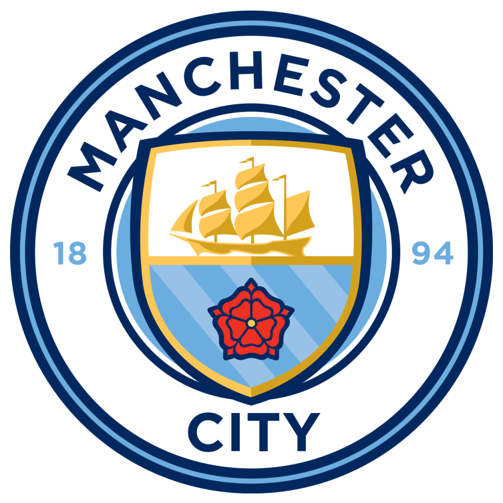
West Ham United, Manchester City, Tottenham Hotspur, Everton, Watford and Crystal Palace
Are we alone in thinking that West Ham and City's badges look like they've been made in Microsoft Paint? Either way, there's something about the modernity of their designs that look a little soulless.
As for Watford, we understand why the hart takes centre stage, but there's something about the design that makes it look like a rather ugly-looking moose doused in red paint.
By contrast, there's not too much to hate about Everton's badge, which almost climbed up to the next tier, but it really did feel like a drop off from the livelier, yellow-shaded effort of the early 2000s.
And a bit like the volume on the television being an odd number, there's something about the Spurs and Palace badges having unusual shapes that really bugs us without us really knowing why.

Easy on the eye
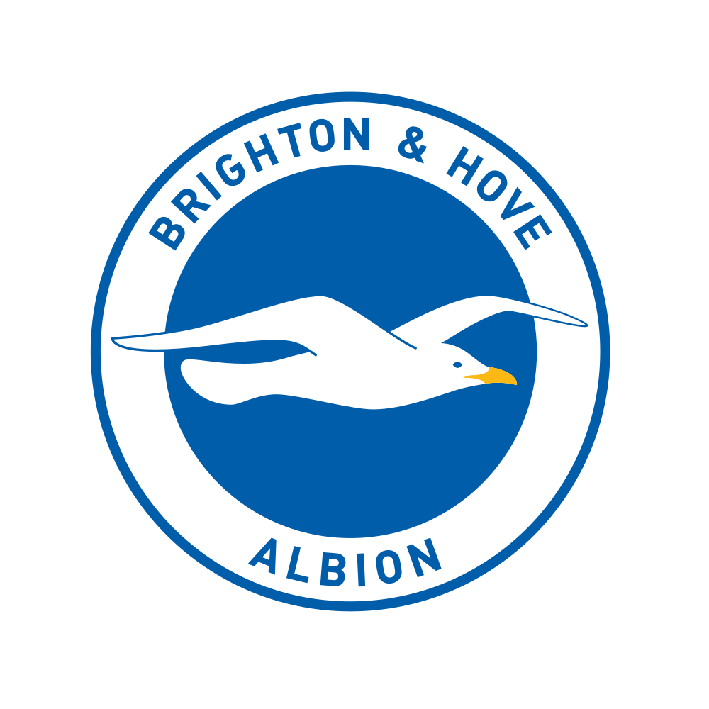
Leicester City, Brighton & Hove Albion, Southampton, Chelsea and Brentford
The common theme here is that these five badges look incredibly clean and smart without necessarily setting the world alight. In other words, they're good, but not great.
Brighton's badge perfectly illustrates why less is so often more, Southampton are that tacky tree away from reaching the 'gorgeous' tier and Leicester's colours sit sweetly in a circular template.
Credit to Brentford for making a bold-coloured bumblebee look as aesthetically-pleasing as it does and our only qualm with the Chelsea badge is that the red footballs add one colour too many.

Gorgeous
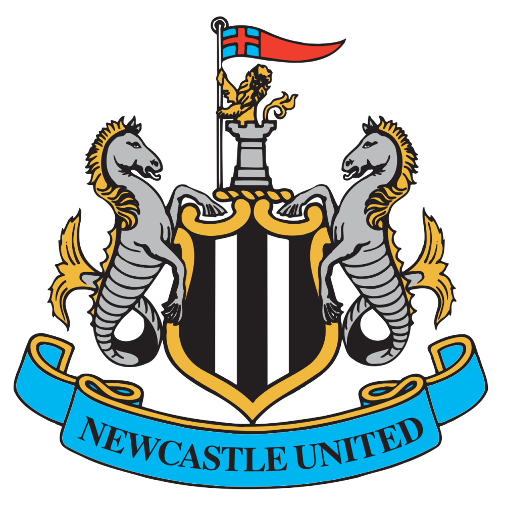
Arsenal, Liverpool, Newcastle United and Aston Villa
Lovely stuff from Arsenal who really let their bold red livery and eye-catching cannon symbol do the talking here with a masterclass in how modern-day badges can look both progressive and classic.
Newcastle do a remarkable job of balancing two seahorses, a shield and castle turret with knight and Villa's logo feels like an upgraded Chelsea effort by allowing their lion to take centre stage.
In terms of Liverpool, they came within a whisker of reaching the highest of heights because if you asked us on another day, they might well have made the cut. It just screams reverence and aura.

Simply beautiful
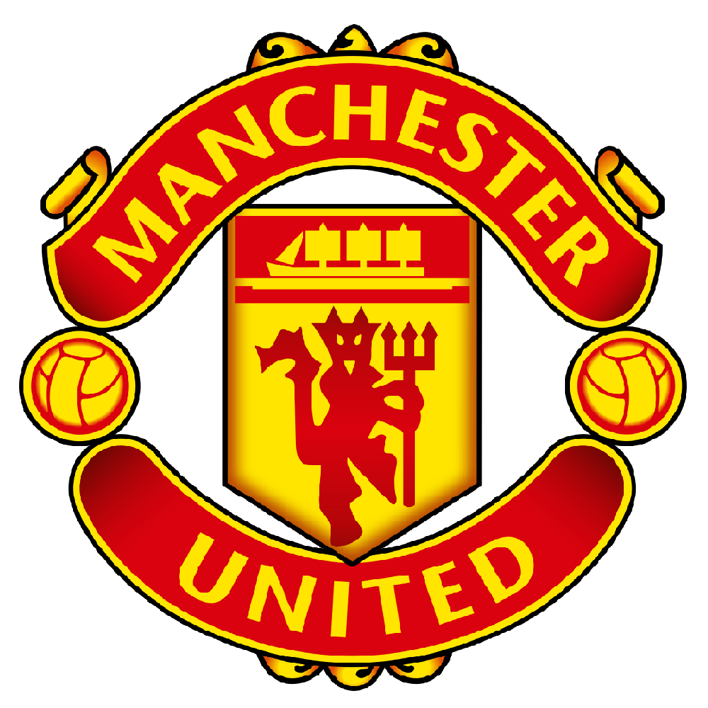
Manchester United, Wolverhampton Wanderers and Leeds United
United's badge is simply next level stuff. Red and gold make for such a stunning colour combination, while the devil and boat iconography blend perfectly within a unique, but still neat, template shape.
As for Leeds and Wolves, I'll openly admit that simple but effective badges are the key to my heart and nobody in the Premier League does it better than these two. No-nonsense stuff: you love to see it.

Full graphic

A matter of personal preference
Well, there you have it, I've probably annoyed half of English football with my woeful opinions on the aesthetics of Premier League badges. You have my sincere apologies, I promise.
However, at the end of the day, it ultimately comes down to personal preference and club badges are a little like football kits where sometimes it's hard to explain why you like the look of them or not.

For me, it's about jettisoning the computer-age decisions of West Ham and City for either the pure simplicity of Wolves or the gorgeous distillations that make United and Liverpool's efforts so iconic.
But fear not even if that explanation still has you raging because we'd love to hear what you think about the Premier League badges, so be sure to let us know across our various social channels.