Every Premier League club has now unveiled their home jersey for the 2021/22 campaign.
While supporters around the country eagerly await the return of club football this summer, they have been able to sink their teeth into the conveyor belt of new releases in the world of sports fashion.
With clubs paying closer attention to their kit designs year on year, it's always fascinating to see which teams go into the new campaign with the best and worst looking designs of the bunch.
Premier League home kits
And now that all 20 home releases have hit the shelves, it would be rude not to nail our colours to the mast by revealing the kits that we consider the most drop-dead gorgeous and downright ugly.
Now, it goes without saying that ranking jerseys is ultimately a completely subjective exercise and this humble writer's opinion is no more or less legitimate than your own thoughts on the shirts.
As such, be sure to let us know your thoughts on the Premier League's 2021/22 catwalk across our social channels, but check out the GIVEMESPORT verdict on all 20 designs down below first.
Man City sign Jack Grealish for £100m (Football Terrace)
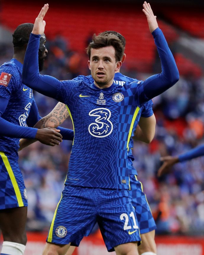
20. Chelsea
Goodness me. Just like their etch-a-sketch chaos from the 2019/20 season, I can't look past the eye-boggling disco pattern that makes Chelsea's new release shimmer and wobble on the pitch.
The yellow trimmings feel really unnatural, the pattern bleeding into the shorts worsens matters and is it just me who thinks the texturing looks like a suspicious extension of the '3' sponsor?
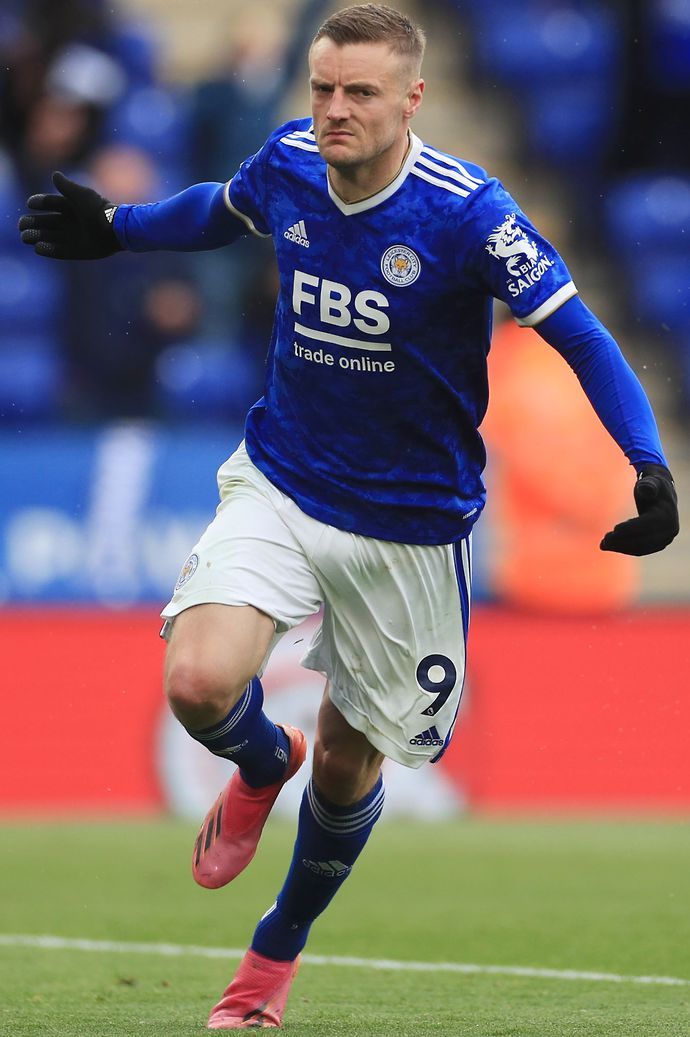
19. Leicester City
From the half-hearted gold trimmings to the over-egged texturing to the wordy and obtrusive sponsor logo, Leicester's latest jersey simply feels patchwork and uncoordinated to me. Sorry.
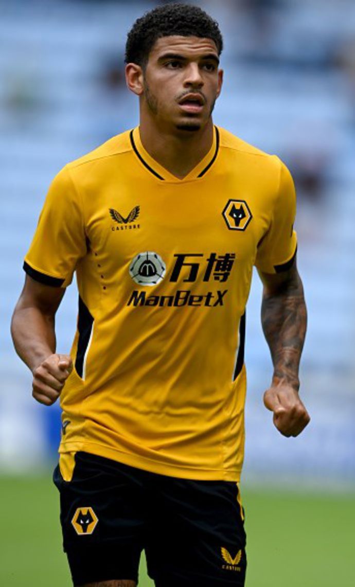
18. Wolverhampton Wanderers
This is just disappointingly samey. There is so much you can do with the badass Wolves logo as well as the unique gold and black colour scheme, so this really feels like an opportunity missed.
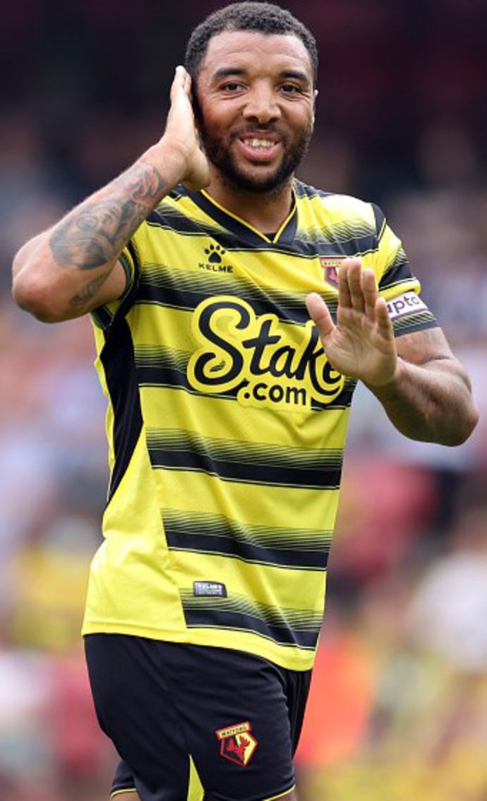
17. Watford
I want to like this a lot more than I do, but the brush-stroke stripes just feel so non-committal and the Hornets undoubtedly have one of the more egregious examples of an obtrusive sponsor.
16. Leeds United
Meh, meh, meh. There's very little to hate about Leeds' new release, but it just feels as though Adidas have swapped out last season's focus on blue for a shoulder-shrugging yellow template.
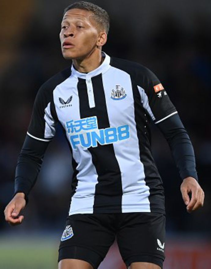
15. Newcastle United
With yet another distractingly large sponsor and set of buttons that plunge bizarrely far down the torso, I'm left cold by a Newcastle jersey that shies away from embracing the club's iconic stripes.
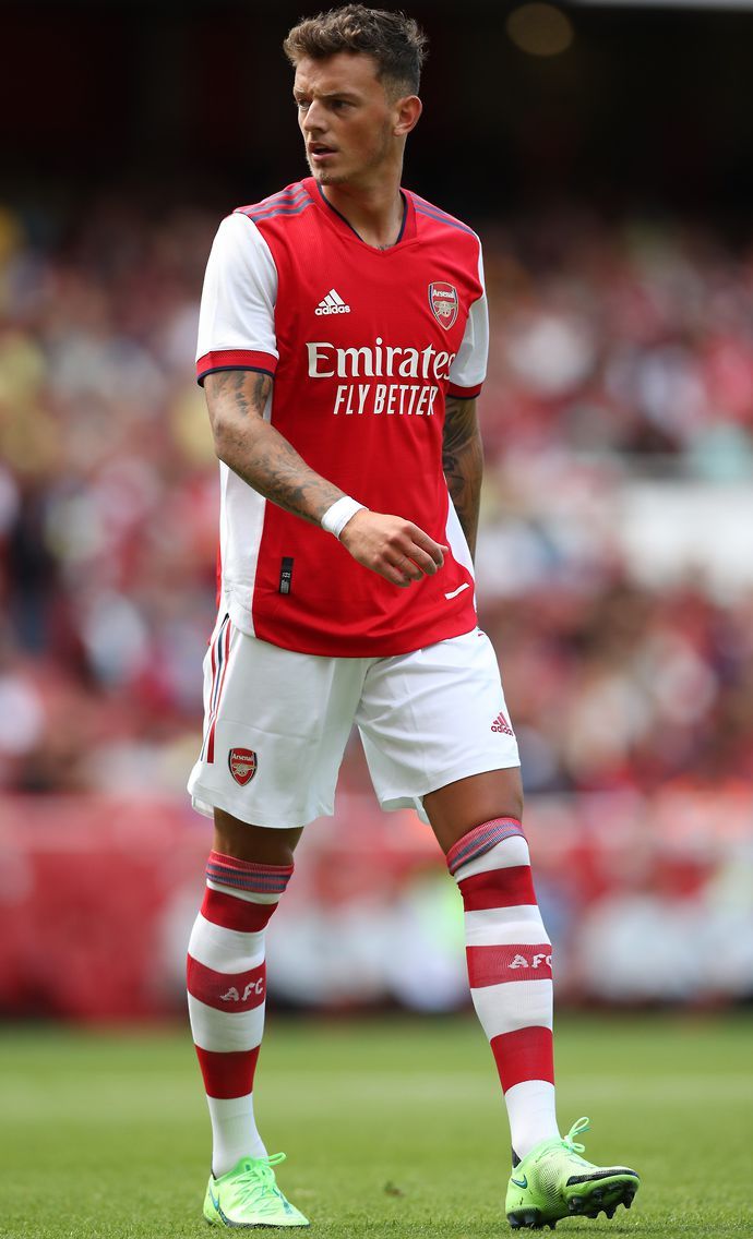
14. Arsenal
It's an alright kit, but it just doesn't look very Arsenal-like, does it? The Ajax vibes are a little too overpowering for my taste and the blue shoulder stripes simply don't blend with the red torso.
13. Brentford
A textbook example of a simple and smart design being sideswiped by an ill-sitting sponsor. The bold back and asymmetrical star of Hollywoodbets spoils an otherwise strong effort from Umbro.
12. Tottenham Hotspur
While there's no denying that Spurs' new kit looks surprisingly smooth and classy, I just don't have it in me to get too excited about what is essentially a plain white jersey. It's a tough one to call.
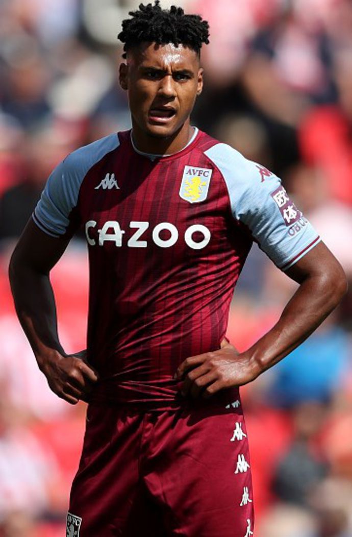
11. Aston Villa
Nice. Kappa have just about stuck the landing with an eye-grabbing set of stripes that could easily have looked like your grandparents' outdated wallpaper.
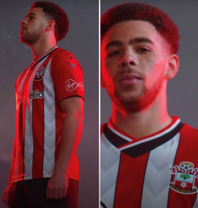
10. Southampton
I'm not as big of a fan as many when it comes to this Hummel design, but the world-class collar and downward chevrons just about counterbalance the general busyness and in-your-face sponsor.
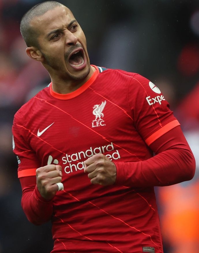
9. Liverpool
I've toed and froed on quite how much I like the unique, orange trimmings, but just about every other aspect of Liverpool's design from the diagonal stripes to the trio of logos is an automatic thumbs up.
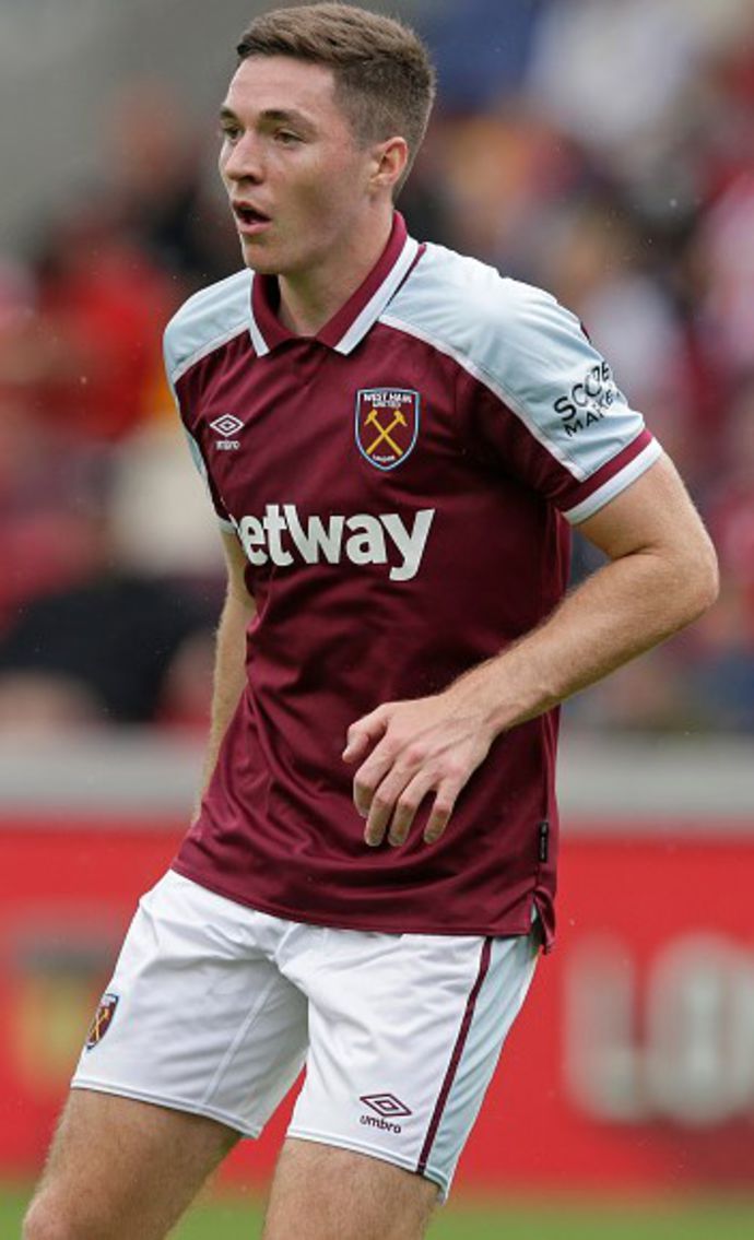
8. West Ham United
While this might have looked more like a darts jersey on most other clubs, there's something about an uncompromising collar set within claret and blue that feels quintessentially West Ham.
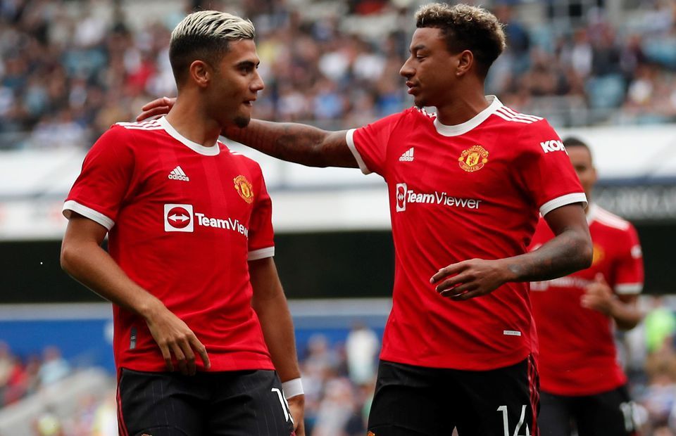
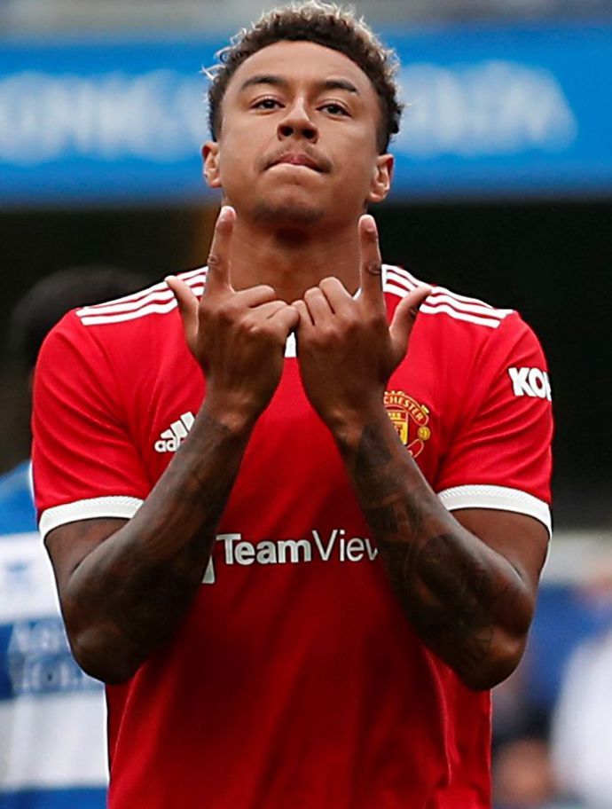
7. Manchester United
It's a grower, this. Sometimes keeping it simple works best for reasons beyond our comprehension and United's old-fashioned design is a bold blast from the past that gets better with every viewing.
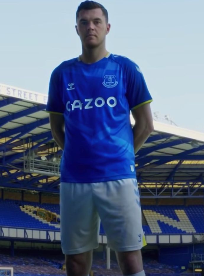
6. Everton
Again, it might not be reinventing the wheel, but Everton have proven that you can blend a bold logo and distinctive patterning and come out the other side with one of the league's best-looking jerseys.
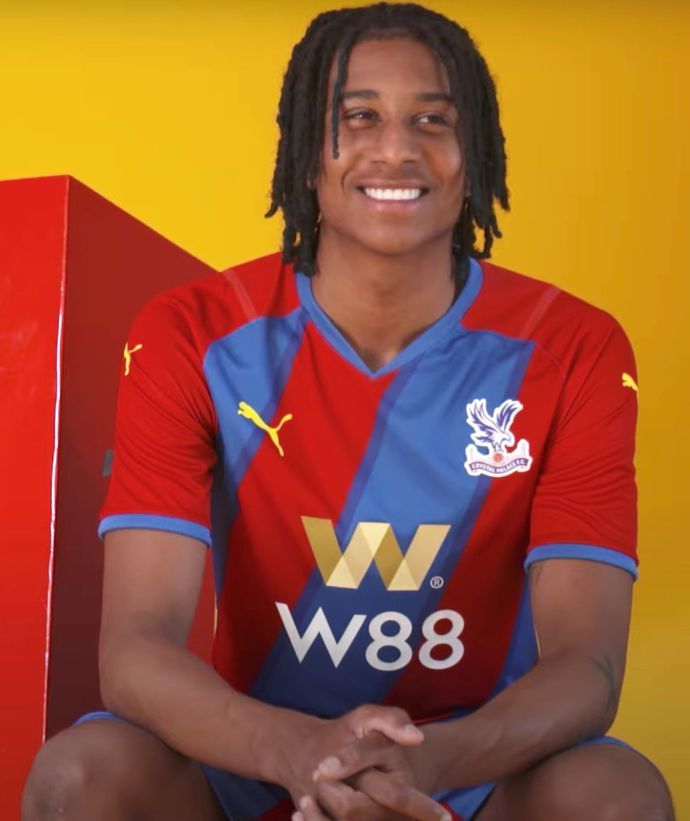
5. Crystal Palace
The final home kit to hit the shelves was an absolute beauty with Palace's uniquely tilted stripes, stunningly bordered with bolder blue shades and golden trimmings, proving an instant hit.
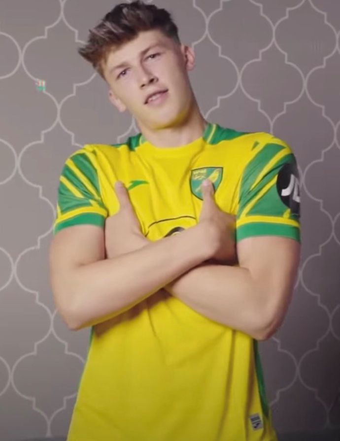
4. Norwich City
Fair, fair play to Joma because Norwich kits are almost always a poisoned chalice, but the jaw-dropping shoulder design channeling the club's Canaries nickname is a stroke of design genius.
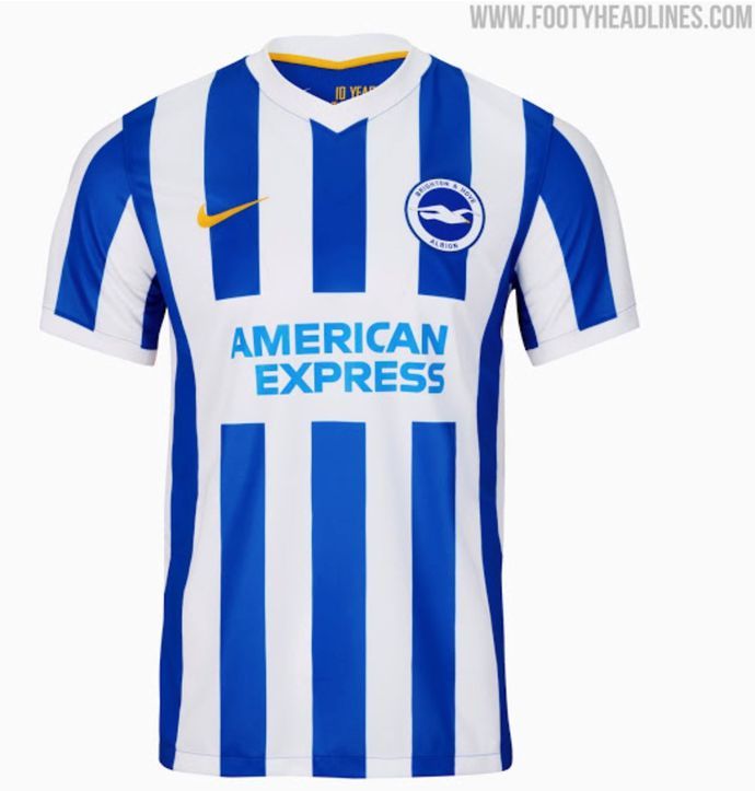
3. Brighton & Hove Albion
Is it simple? Yes. It is breaking new ground? Absolutely not. But does it look downright brilliant? You're damn right it does, so I'd be remiss not to give Brighton a well-deserved spot on the podium.
IMAGE CREDIT: FOOTYHEADLINES.COM
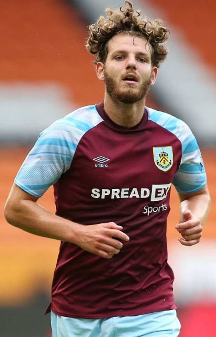
2. Burnley
Yup, seriously. I'm going to get absolute pelters for this, I can tell, but I'll happily die on the hill that Umbro have knocked it out the park with a delicious template that's all about the shoulder texturing.
The placement of the pattering within a cool and classy shade of blue is simply world-class and the various logos working together in harmony goes to show that Burnley kits can indeed look brilliant.
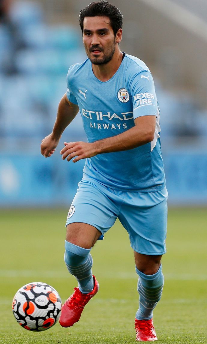
1. Manchester City
I told you this was a subjective list and yes, it's genuinely hard to explain why I love City's jersey so much, but I just knew from the moment it was released that it was going to be difficult to beat.
The super subtle texturing makes this design dance off the screen, while the 93:20 in the inner collar is a lovely touch and the white trimming really allows the sky blue hues to hog the limelight. Superb.
Which kit is your favourite?
We've slandered your favourite kit and eulogised the one you hate the most, haven't we? Well, it just goes to show that the crazy world of football shirts really is just a matter of opinions.
And with so much work going into football kits each year from the clubs to the manufacturers, I will never hesitate to tip my hat to anyone behind what is ultimately such an important part of the sport.
ENTER GIVEAWAY
The pattern or trimmings of a jersey might not win Premier League matches, but they imprint themselves on the minds of supporters for whatever memories were created while wearing them.
I, for one, am unabashedly a football kit nerd and nothing would please me more than to see each of these 20 kits getting some love even if a few of them don't ticket my own, personal boxes.
