We're only a few weeks away from every single kit for the new season hitting the shelves.
With the world's biggest clubs returning to action for the 2021/22 campaign over the last few days, fans have been able to see their side's swanky new jerseys for the very first time on the pitch.
Some of the designs are bound to fly off the rails with gorgeous patterning and colour combinations, while others have inevitability fallen flat and might well have paved a fast-track to the winter sales.
2021/22 kit releases
As such, here at GIVEMESPORT, we haven't held back from separating the good, the bad and the ugly from this year's kit releases and we have already ranked the 15 most stunning strips of all.
But now, it's time to look at the opposite end of the spectrum because it's only natural that certain kits have left fans cold with some quirky design choices, garish colours and sponsorship chaos.
In the end, we settled on 16 kits that we think are the bottom of the barrel for various reasons and from there, we've ranked them to establish who takes the wooden spoon for the 2021/22 season.
ENTER GIVEAWAY
Now, it's important to bear in mind that our choices are solely based upon the opinion of your humble writer and ranking something like football kits is ultimately an entirely subjective affair.
Besides, lest we forget that football shirts play such a huge role in the sport's wider cultural reach, so kudos to everyone behind these kits designs, even if they didn't necessarily float my boat.
Oh, and we're only including kits that have been officially released by their clubs at the time of writing, so Tottenham Hotspur's potentially-catastrophic third jersey has dodged a bullet.
Norwich 0-3 Liverpool Highlights (Football Terrace)
The worst 2021/22 kits
However, enough with the disclaimers and housekeeping because it's time to jump into the jerseys that, for me, proved the worst looking for the 2021/22 campaign - check them out down below:
Image credits: Footy Headlines
16. Juventus home
Is this a bad kit? Absolutely not, but it's a pretty decent kit that's been side-swiped by a really ugly and cartoony addition to the classic 'Jeep' logo, which is enough of a crime to earn itself a selection.
15. Celtic third
Similarly, Celtic's alternate strip is a strong effort that is ultimately knee-capped by one poor design choice and that's the bewildering move to place the club's iconic jersey halfway down the shirt.
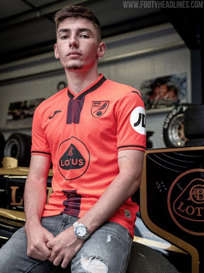
14. Norwich City third
I've never really been a fan of jerseys with one random line down the middle and things are made even worse here by one of the worst colour choices out of any Premier League kit this season.
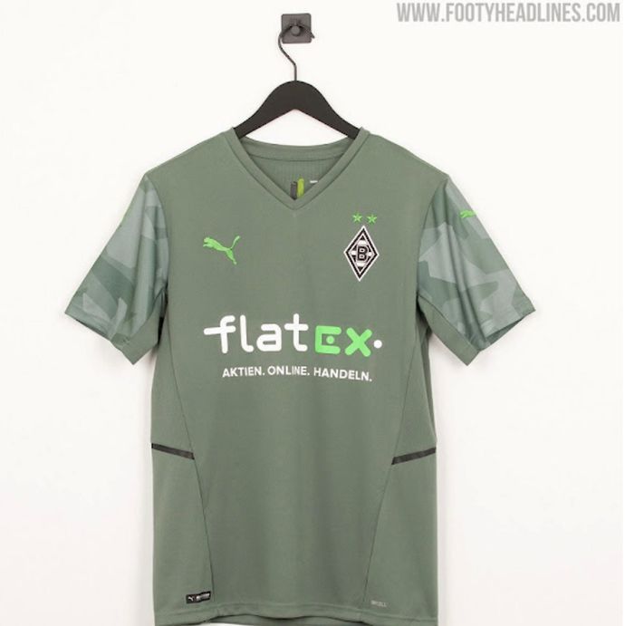
13. Borussia Monchengladbach away
Again, is this really the sort of colour that you want to build a football kit around? Not for me because Gladbach's olive green design just smacks of dullness.
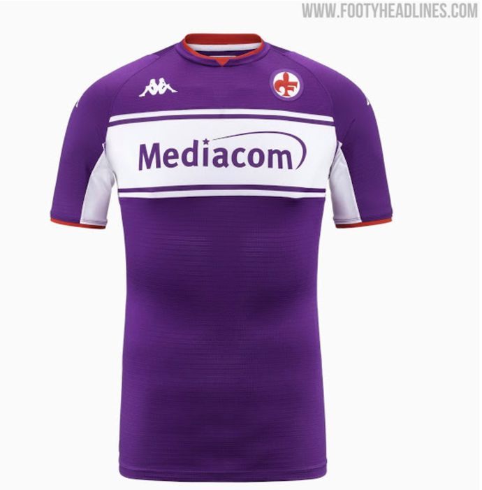
12. Fiorentina home
This is a far, far cry from some of the gorgeous Fiorentina kits that we've seen over the last 20 years and the reversion to the 1980s badge, albeit a lovely thought, cheapens its appearance in my eyes.
11. Barcelona home
Speaking of lovely thoughts that don't quite do it for me, I love the idea of Barcelona building a kit around their badge in theory, but think it looks like a messy mish-mash in practice. And don't get me started on the shorts...
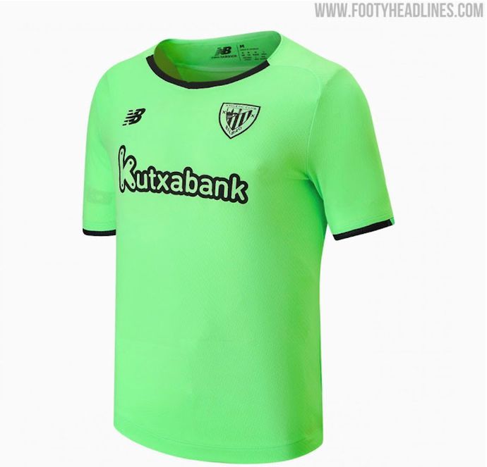
10. Athletic Bilbao away
It speaks volumes that the colour and the colour alone is what makes Bilbao's away strip look so garish and lurid because an otherwise simple design is undercut by the unforgivable mint green.
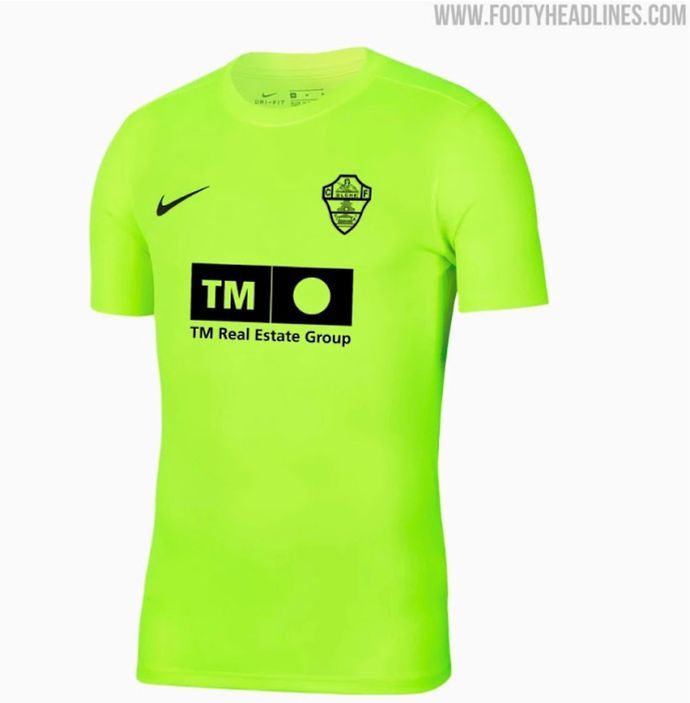
9. Elche third
See above... but even worse.
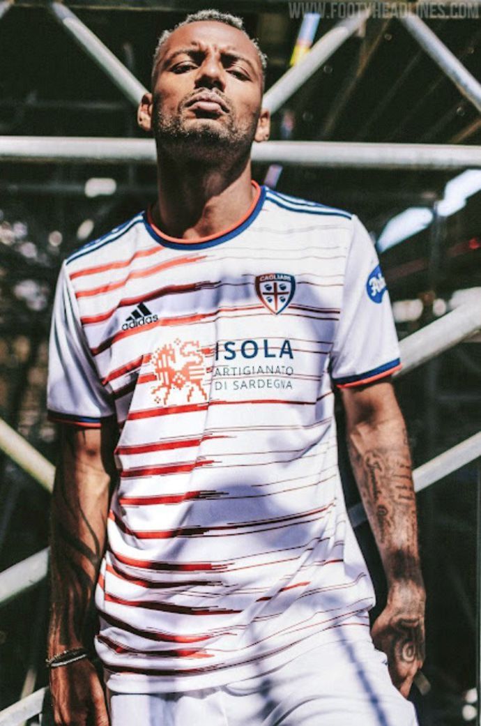
8. Cagliari away
Yes, I know that Cagliari have released similar away kits in the past, but that doesn't endear me any more to the messy-looking horizontal sketches and the wordy sponsor that sits on top of them.
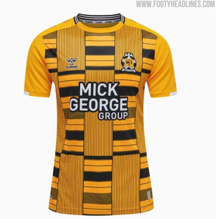
7. Cambridge United home
I want to like this, I really do, because Hummel deserve credit for trying something different, but it's just ended up looking like a disorganised muddle that reminds me of when your printer is running low on ink.
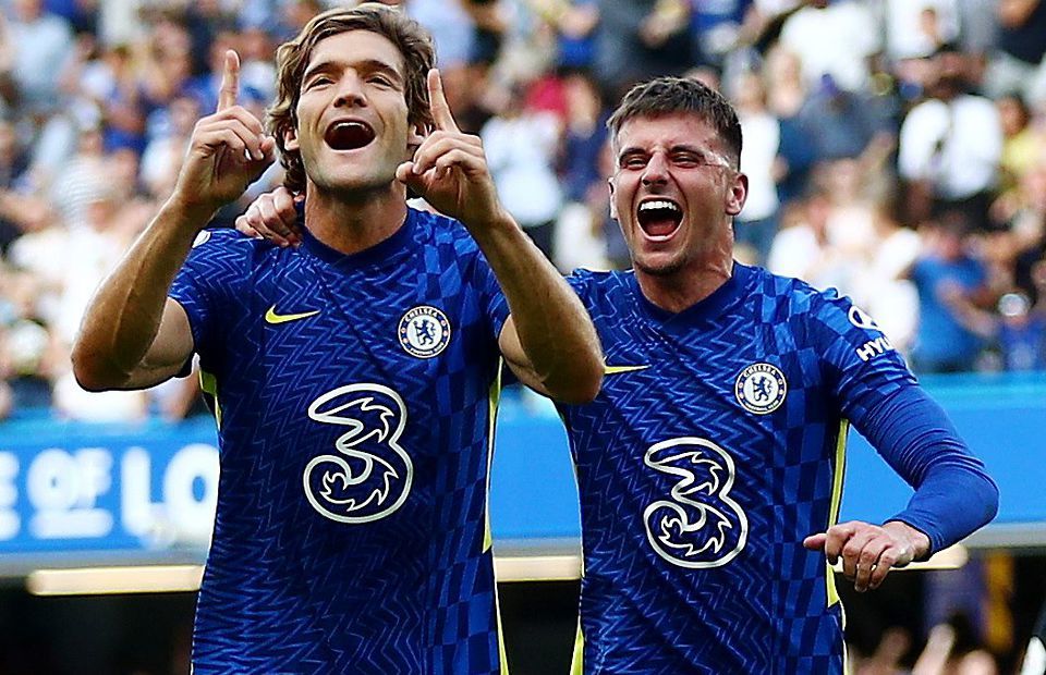
6. Chelsea home
Nope, nope, nope. I know this jersey has plenty of admirers, but Nike's decision to mash every texturing pattern available to them together makes it look like kaleidoscopic in all the worst ways.
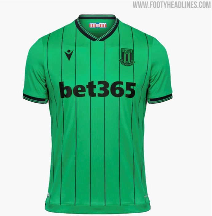
5. Stoke City away
The template is fine and so are all the logos, but I guess it's at this point that I realise I have some sort of in-built hatred for strange green colours because Stoke's away strip is a shocker for me.
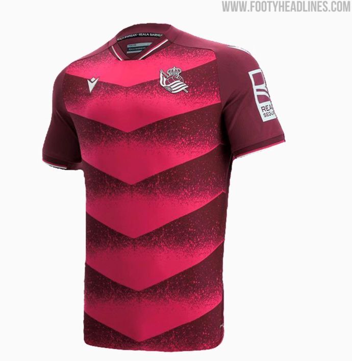
4. Real Sociedad away
While, yes, I'm not sold on the pinky reds on display here, it's more the off-putting arrow template that discourages me because it bizarrely looks like a series of arrows pointing towards... ummm...
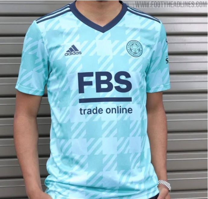
3. Leicester City away
Ok, ok, ok, so we're back to bashing minty green colours, I know, but Leicester's colour choices are only compounded by a texturing that just looks cheap to me by way of being so large and blown up.
2. Barrow home
I feel bad, I do, but the simple fact of the matter is that the texturing has been massively over-egged and when you marry that to the wordiest sponsor in history, Barrow's kit basically falls to pieces.
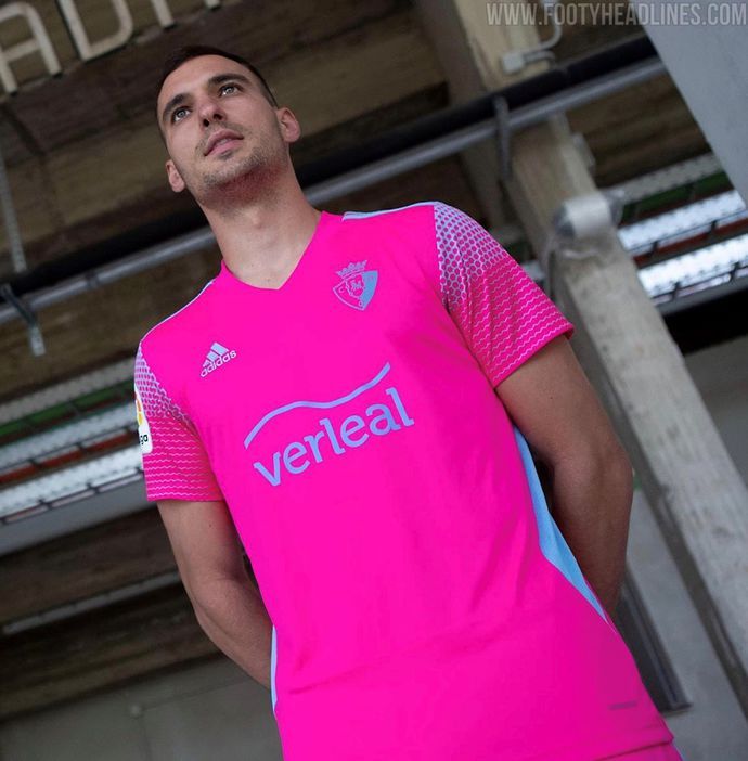
1. Osasuna third
Sigh, it couldn't have been anything else. Pink strips are by no means automatically bad, but they most certainly are when it's a neon shade stuffed into an out-dated template with weak blue trimmings.
Do you rate any of these kits?
So, there you have it, those are the 15 jerseys that I consider to be my least favourite from the current 2021/22 releases.
No doubt many of you will be huge fans of some of the kits that I have criticised and honestly, that's great to hear because it really goes to show just how subjective the world of football shirts really is.
And when specific designs can go on to become iconic to certain supporters, we can't wait to see which shirts - whether I happen to like them or not - make history during the 2021/22 campaign.
That being said, even if Osasuna miraculously win La Liga, I'm not sure it could persuade me to go easy on their third strip...
