The Champions League is officially back in action.
While the qualifiers, play-offs and group-stage draw might have whetted your appetite, there's nothing quite like seeing the players stand before the famous anthem in the competition proper.
And there are plenty of things for fans to get their heads around in the 2021/22 campaign with Cristiano Ronaldo back at Manchester United and Lionel Messi playing for Paris Saint-Germain.
Champions League kits
It will also be an opportunity for the 32 clubs to show off their new kit releases for the season, which is an annual process that is slowly coming to a close with the last drips and drabs of third shirts.
However, while we wait for those final designs to hit the shelves, we're happy to say that every single club in the Champions League group stages has already unveiled their away jerseys.
LUKAKU is WORLD CLASS! Chelsea 1-0 Zenit (Football Terrace)
Here at GIVEMESPORT, we have already ranked all 32 Champions League home kits and now it's the turn of the alternate releases, which are so often more bold and brave with their designs.
To do so, we're calling upon FootyHeadlines' fantastic overview of the European designs in collaboration with Football Kit Archive.
Now, it goes without saying that the ranking is conducted in completely subjective fashion and my opinion on these jerseys is no more or less legitimate than your own thoughts.
Besides, a lot of work goes on behind the scenes to release these designs and we're delighted that all 32 of them will have their lovers even if I happen to prefer certain shirts to others.
Oh, and it's important to point out that the decisions are being made on the aesthetics of the design alone as opposed to any deeper meanings or tributes that might be emoted by the jersey.
Champions League 2021/22: Fixtures, Draw, Results, Odds, Scores And Everything You Need To Know
Ranking Champions League away kits
But anyhow, enough with the disclaimers, it's time to dive into the 2021/22 Champions League wardrobe and rank all 32 away kits from worst to best looking based on the opinion of yours truly.
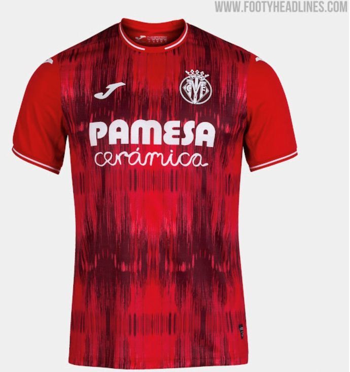
32. Villarreal
Oh my goodness me. This is a massive no-no from me. The wild shades of red on a scatterbrained texture make this the worst-looking Champions League away kit in my eyes.
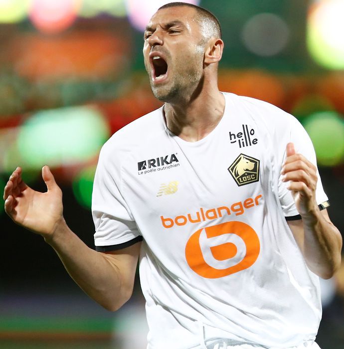
31. Lille
This colour combination couldn't work any less coherently if it tried. The white and gold combination is alright, albeit unoriginal, but the huge orange sponsor really bulldozes the design of any merit.
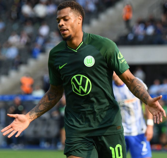
30. Wolfsburg
Call me a broken record, but garish green colours simply don't translate to attractive kits, which makes for a pretty difficult scenario when you're designing Wolfsburg strips...
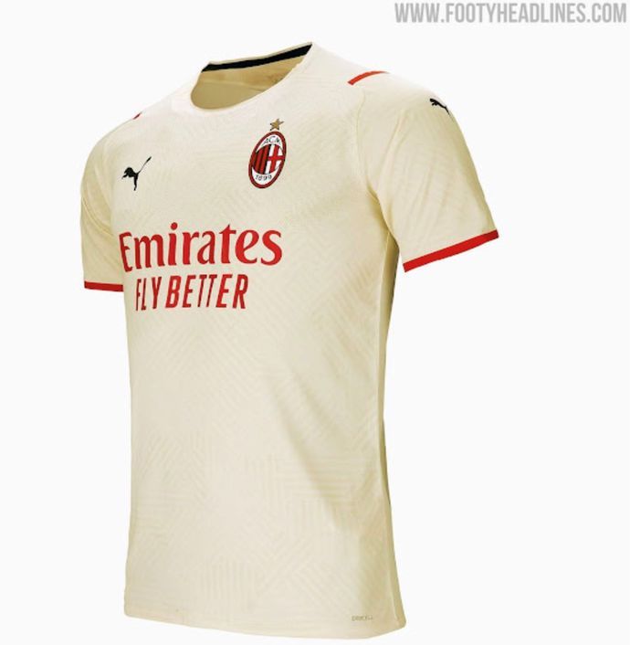
29. AC Milan
The miniature city maps as a nod to the 'Sport for Change' project is a lovely touch, but purely from an aesthetics perspective, this bizarre colour palette feels distinctly bland and stale to me.
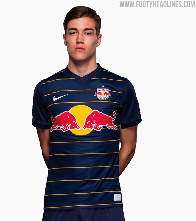
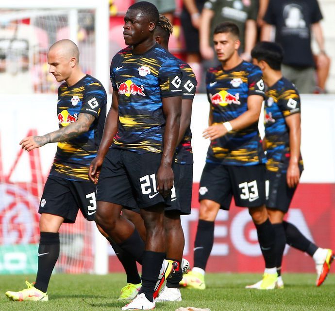
28. Red Bull Salzburg
The yellow horizontal stripes on the navy background just scream cheap t-shirt to me and that's before I mention the completely overblown Red Bull logo that makes up half the jersey. Sigh.
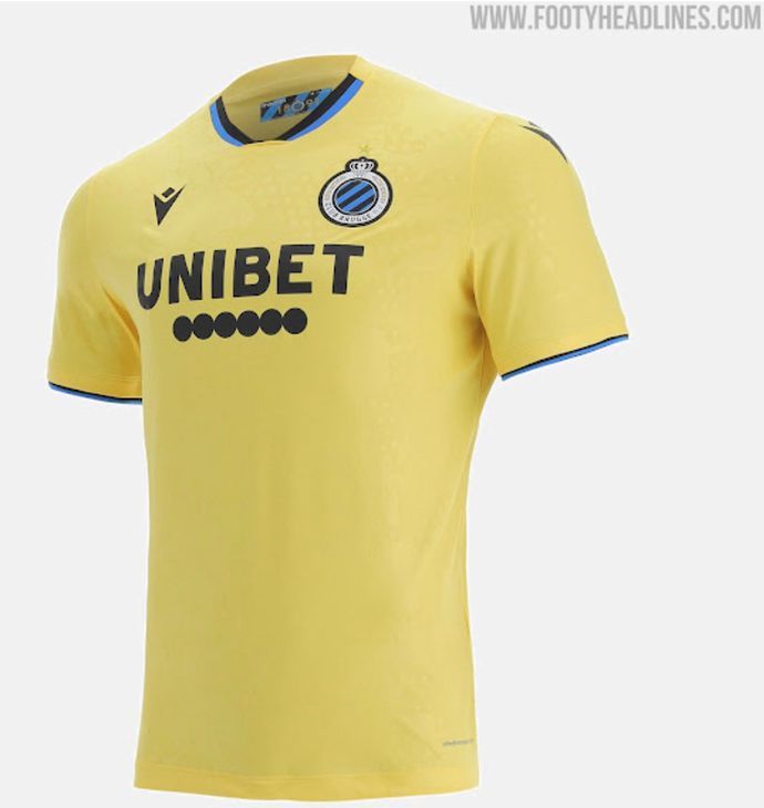
27. Club Brugge
Don't get me wrong, we're getting into stronger territory now, but we're always up against it when it comes to yellow jerseys and this Brugge effort feels so ill-fitting with the black and blue trimmings.
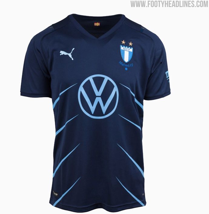
26. Malmo
Although this jersey largely just flirts with 'meh' territory, the completely unnecessary and random diagonal lines feel like one of the season's most redundant design flourishes.
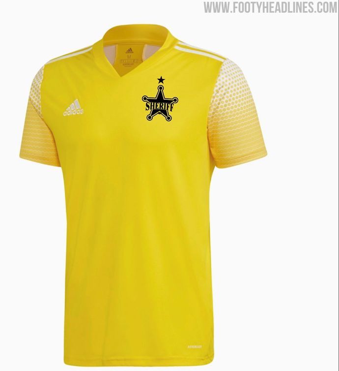
25. Sheriff Tiraspol
Ok, so this is a long story because it's only now that FootyHeadlines have clarified the situation that we've been able to establish which of Tiraspol's kits is their home and away designs respectively.
As such, eagle-eyed viewers might notice that we accidentally included this in our home shirt list - apologies, Tiraspol fans - but that doesn't mean that the pretty vanilla design has grown on us at all.
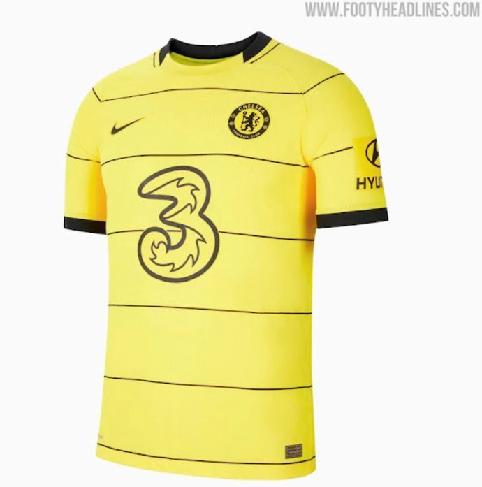
24. Chelsea
The design is fine. The colour isn't. That is all.
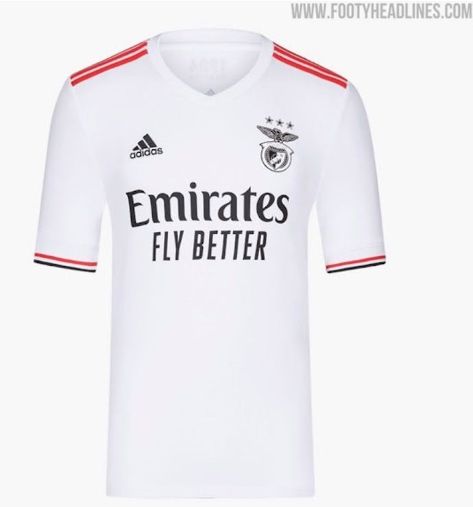
23. Benfica
Meh, meh and more meh. I would have preferred this shirt a lot more if Adidas hadn't made the club badge black and white, too, but that still wouldn't have saved a largely safe and steady release.
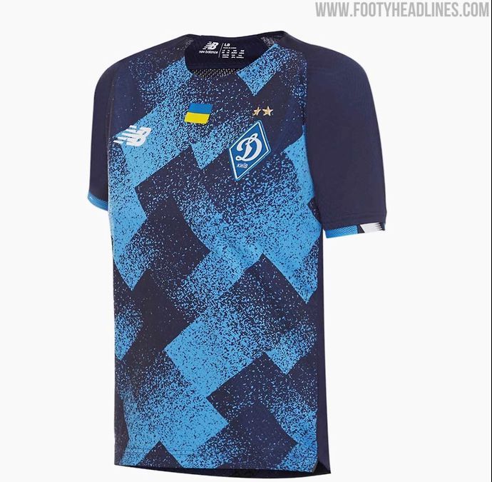
22. Dynamo Kiev
While we loved this very same smudged texturing on the home shirt, it just feels so much more clunky and heavy-handed upon the navy of the away kit. It's by no means a bad design, though.
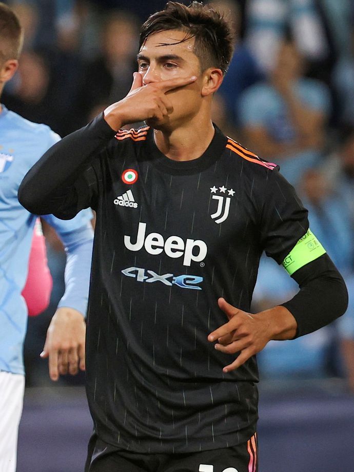
21. Juventus
I've banged on, on and on about how infuriating the '4XE' sponsorship has been on Juventus' shirts this season and it once again sideswipes a pretty solid design with a glimmering shoulder pattern.
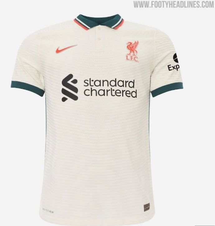
20. Liverpool
What makes this jersey so frustrating is the fact that it's so run of the mill compared to the stunning 1990s design on which it's based and that's exactly why it continues to tumble down my rankings.
19. Bayern Munich
How have Adidas managed to plonk a black and gold kit finish so low in our standings? Well, for us, the bizarre kite-like design is the culprit because it just looks so forced and unnecessary.
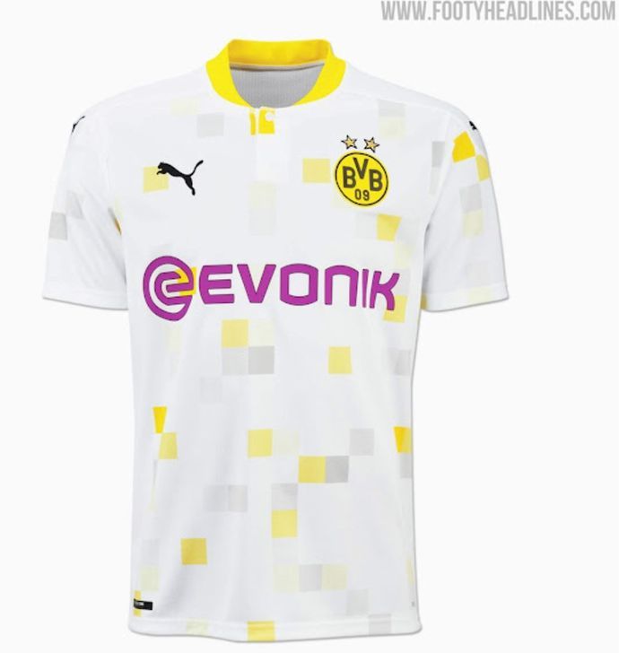
18. Borussia Dortmund
White, yellow and grey with a boldly purple sponsor ensures that a typically smart and suave BVB template is kneecapped by a distinctly bewildering colour scheme.
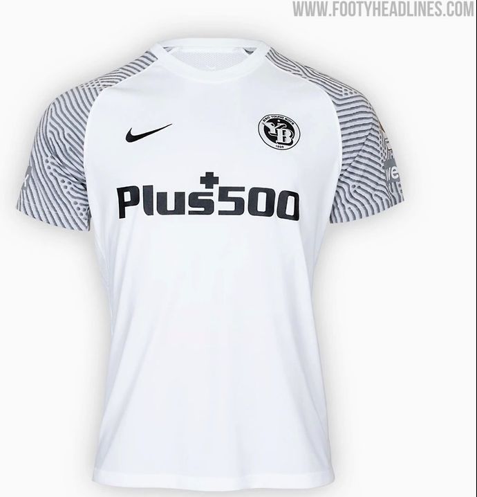
17. Young Boys
Does it look a little bit like a goalkeeper jersey? Maybe, but the unabashedly wild patterning on the sleeves elevates an otherwise uninspiring design to the higher heights of our middle sections.
16. Manchester United
Again, like the Liverpool strip, this is a solid shirt that is let down by the fact it falls so far short of the design on which it was based. The 2021/22 version can't hold a handle to the 1990/92 inspiration.
15. Sevilla
Perhaps not as good as the United shirt, sure, but you can bet that it's far less anger-inducing. Just as smart, simple and sophisticated as you'd expect from a Sevilla release.
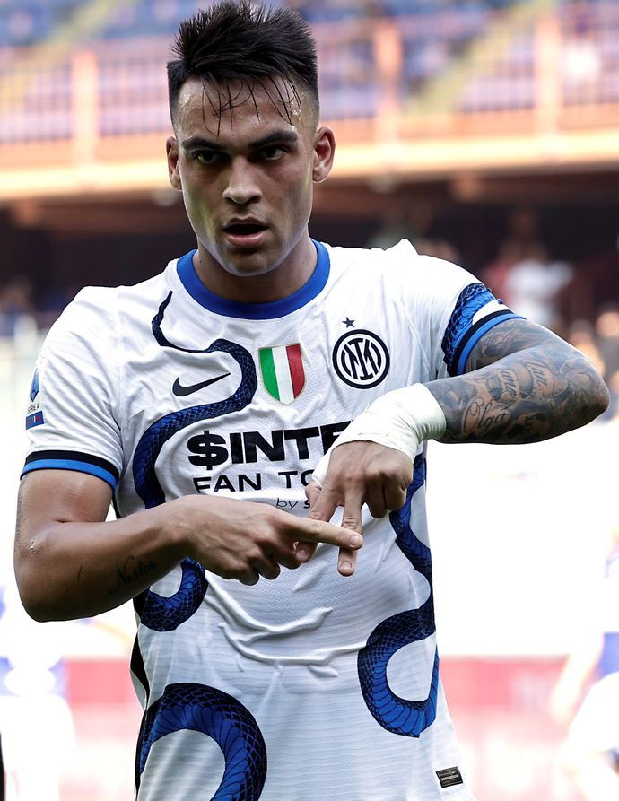
14. Inter Milan
Ugh. 'Frustrating' has been the key word for a lot of jerseys in this area of the list, but nothing makes me want to throw my toys out the pram more than Inter Milan's wordy and obtrusive sponsor.
I absolutely adore the throwback to the iconic snake design and this might well have finished in first place if it wasn't for an absolute essay of a logo that completely undercuts this superb Nike effort.
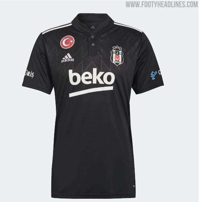
13. Besiktas
I'm a sucker for black jerseys, it must be said, so this Besiktas kit certainly has an immediate advantage, but the feather-like texturing and strong collar are certainly big plus points too.
12. Atalanta
Grass is green. Water is wet. Atalanta shirts are smart.
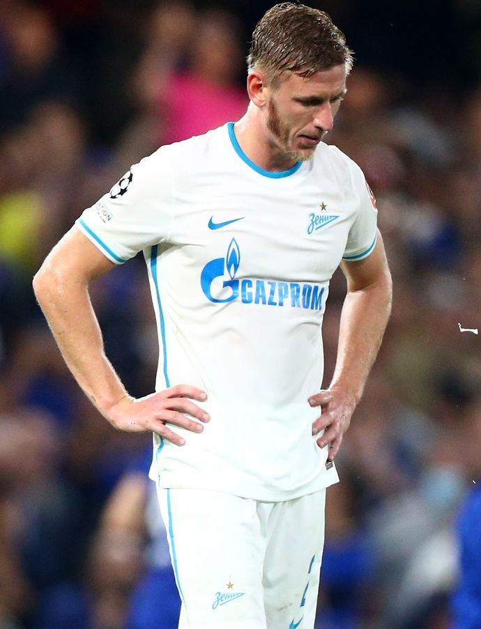
11. Zenit St. Petersburg
Gazprom and Zenit are one of those club-sponsor relationships that marry so, so well on a football kit and there's just something about the icy cold blue on a white background that looks so sharp.
10. RB Leipzig
We like it, we do, but just not as much as everyone else. The red, blue and yellow scratchings play a dangerous balancing act between looking like a world-class kit and more of a warm-up shirt.
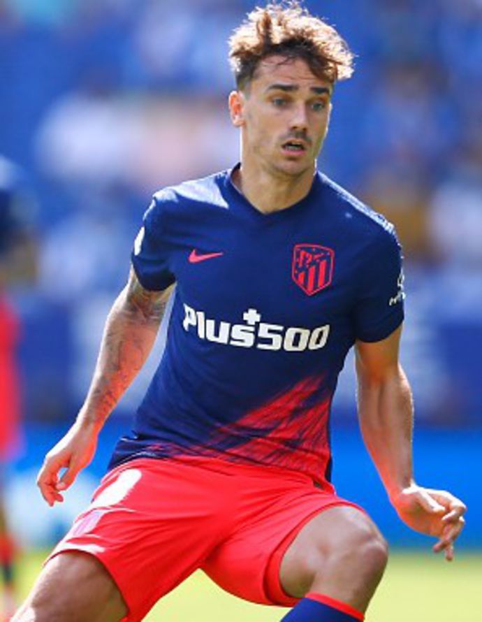
9. Atletico Madrid
It's not as good as the home design, but we've got a lot of time for the paint theme that's going on at Atletico this season and how good do those shades of blue and red look together?
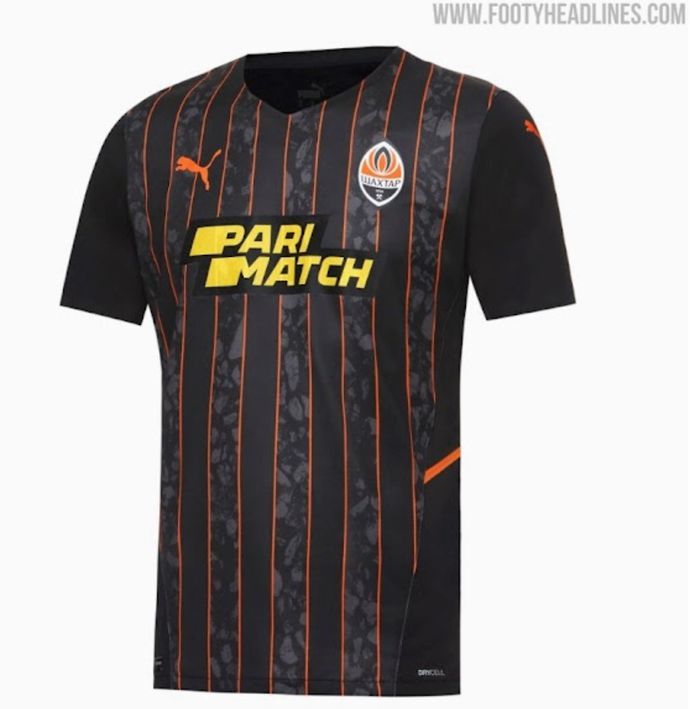
8. Shakhtar Donetsk
Orange and black looks badass at the best of times, never mind when it seamlessly marries to the Shakhtar badge for a kit so brilliant that it makes me forget about that darn Pari Match sponsor.
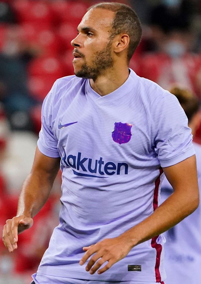
7. Barcelona
The shimmering badge on a lush and luxurious purple background makes this a feast for the eyes and just about makes up for the Frankenstein's monster that is their home strip.
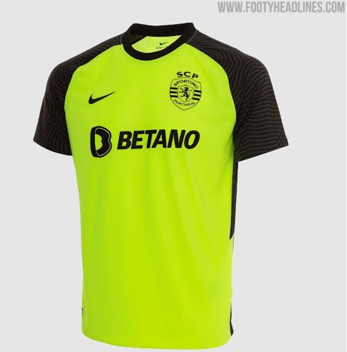
6. Sporting Lisbon
Have I lost my mind? No, no I haven't, because there's something about this unashamedly bold shade of green that fits Sporting hand in glove and the black shoulder patterning is so neat and tidy.
5. Manchester City
However Puma have managed to deliver that stunning shimmer of purple, pink and blue on the logos is beyond us, but it's an absolute treat for the eyes on a simple white background. Superb.
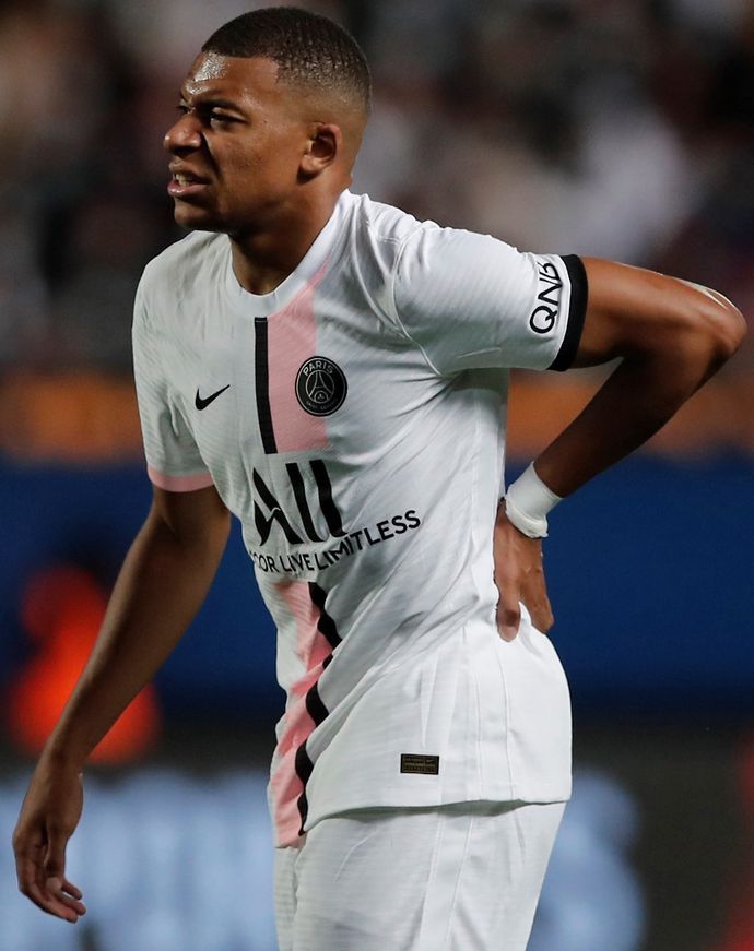
4. Paris Saint-Germain
Speaking of predominately white kits with gorgeously simple designs, Nike have hit it out of the park for the ten-millionth time when it comes to PSG kits because this pink and black release is belting.
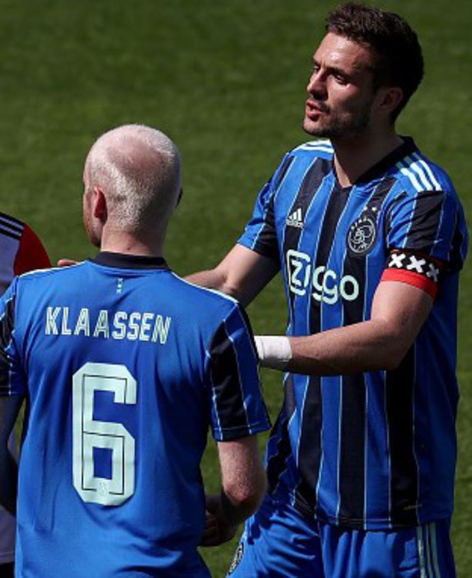
3. Ajax
The Dutch giants are pumping out amazing kits like they're going out of fashion and while it might not compete with the 'Three Little Birds' effort, these blue and black stripes are superb nonetheless.
2. Real Madrid
My gut tells me that the scribbly, graffiti-like texturing should look over egged and messy, but my eyes tell me that it's an absolute stunner framed within dazzling shades of blue, white and gold.
1. FC Porto
Take my money. The various shades of blue effortlessly shake hands with the gold trimmings of the logo for an eye-popping design that shoots right up to the top of our list with some deft texturing.
However, try as we might to breakdown exactly why we think it's our favourite Champions League away kit this season, the best thing to do is simply bask in its greatness by checking it out below.
Which away kit is your favourite?
There's just so much more wiggle room when it comes to away kits, isn't there?
The talented designers and manufacturers across the industry are less bound by tradition and history, allowing them to let their imaginations run wild and really think outside of the box.
I guess that's why my dislikes and likes make for even stronger opinions in the alternate kits compared to the home versions and that, in turn, probably makes my ranking even more divisive.
ENTER GIVEAWAY
However, fear not, because if that's the case then I'd love to hear what you consider to be your favourite and least favourite 2021/22 Champions League away shirts across our social channels.
