It's difficult to get a home kit wrong, really. Unless you're Cardiff in 2012 and decide to completely change the colour from what it has been for the best part of forever.
Barring any drastic changes that might interfere with the history of a club, though, it's not too hard to make a home kit good. Or so you'd think.
With the modernised conventions of a new home strip every season, trying to produce something fresh and appealing while maintaining traditional principles can make for a few forgettable designs here and there.
Sometimes, though, kits become unforgettable, for all the wrong reasons. Unforgettably hideous.
Having gone through and picked out the best home kit ever for the Premier League's class of 2021/22, it's only fair that we pick out their worst efforts, too. Can never be too humble.
So, without further ado, here is each 2021/22 Premier League club's worst ever home kit.
Arsenal - 2015/16
PUMA's second year on the job as kit supplier for Arsenal wasn't a great one. White sleeve going right up to the neck, a strange collar with a gap in the front, and an even weirder button. Oh, we can't forget the random block of white on the back of the shirt at the bottom, too. Tried too hard.
WATFORD, ENGLAND - OCTOBER 17: Olivier Giroud of Arsenal celebrates as he scores their second goal during the Barclays Premier League match between Watford and Arsenal at Vicarage Road on October 17, 2015 in Watford, England. (Photo by Jan Kruger/Getty Images)
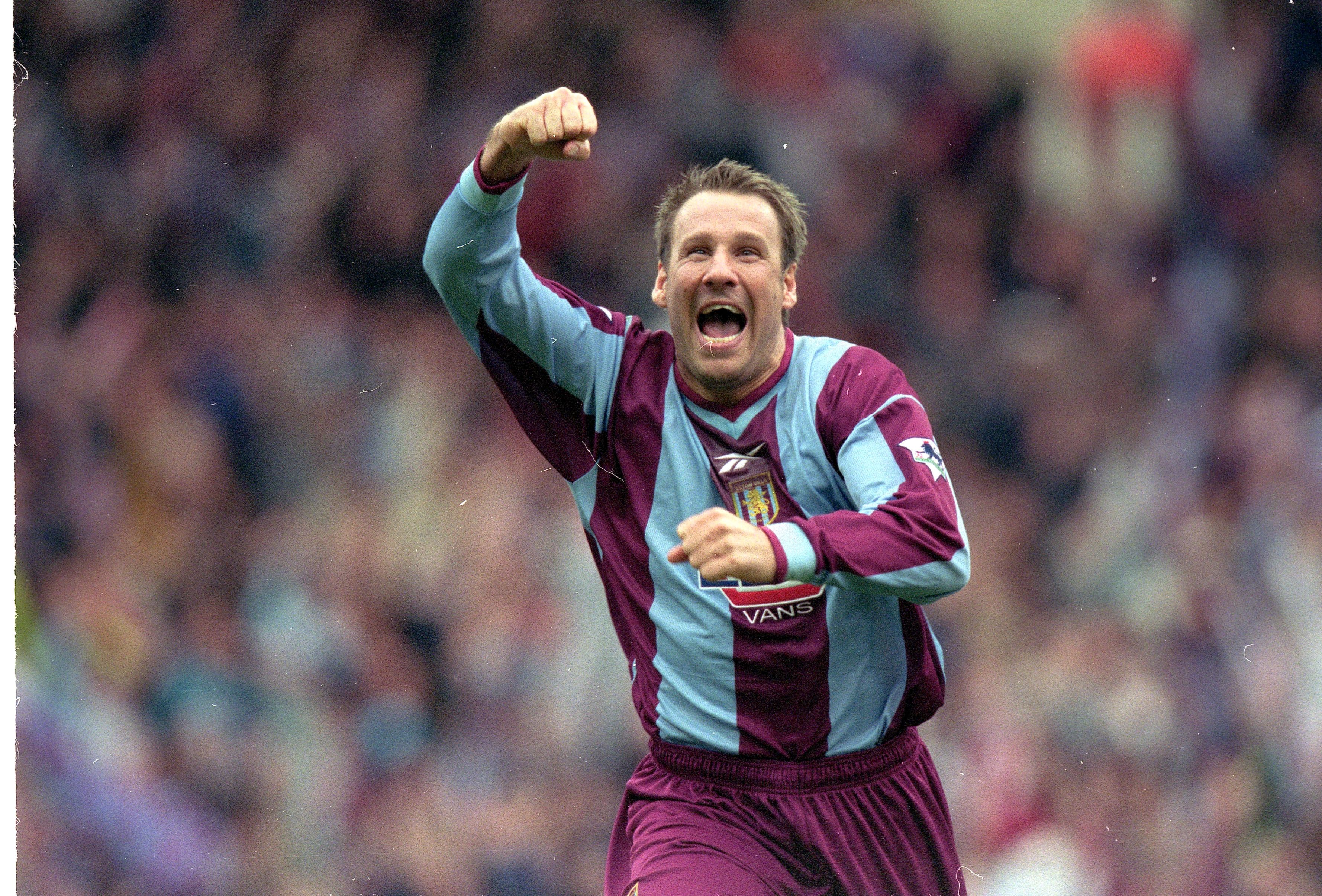
Aston Villa - 1999/00
Claret and blue is often pretty easy to work with, but Villa's kit was a serious miss on the turn of the millennium. Unfortunately, they finished FA Cup runners up in a poorly done striped effort, with their usual colours appearing more pale than usual. Very Sunday league.
2 Apr 2000: Paul Merson of Aston Villa celebrates during the AXA Sponsored FA Cup Semi Final between Aston Villa and Bolton Wanderers at Wembley in London. The game finished 0-0, Aston Villa won 4-1 on Penalties. \ Mandatory Credit: Phil Cole /Allsport
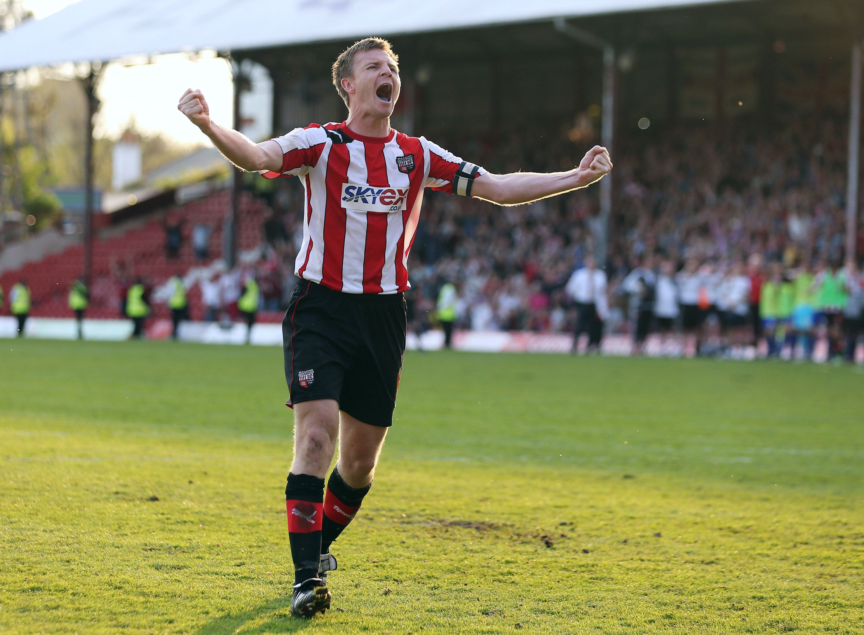
Brentford - 2012/13
PUMA's decision to design a template with their logo placed up on the shoulder rather than the chest was odd, but whatever. The real calamity of this kit was the hideous, white back, which had no stripes on. Looked like they were wearing two different shirts in one.
BRENTFORD, ENGLAND - MAY 06: Tony Craig of Brentford celebrates after scoring a penalty in the npower League One Play Off Semi Final, Second Leg match between Brentford and Swindon at Griffin Park on May 6, 2013 in London, England. (Photo by Ian Walton/Getty Images)
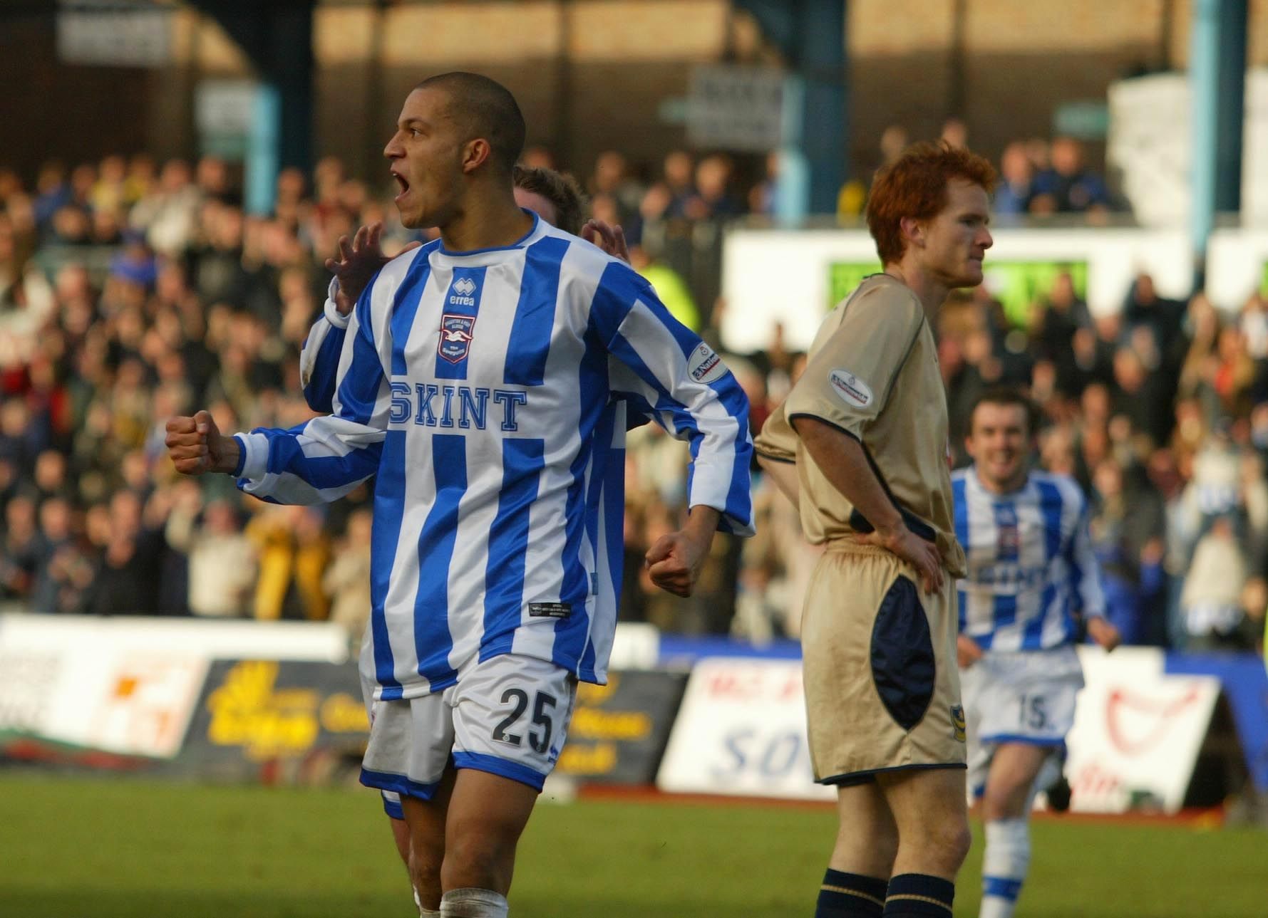
Brighton - 2002/03
A kit that fitted a dismal season where Brighton were relegated, this one was a stinker. Errea placed all of the badges and sponsors down the middle and strangely high up, and finished off the shirt with a collar that looked like a production error.
BRIGHTON, ENGLAND - JANUARY 18: Bobby Zamora of Brighton celebrates scoring their first goal during the Nationwide League Division One match between Brighton and Hove Albion and Portsmouth at the Withdean Stadium in Brighton, England on January 18, 2003. (Photo By Mike Hewitt/Getty Images)
Burnley - 2015/16
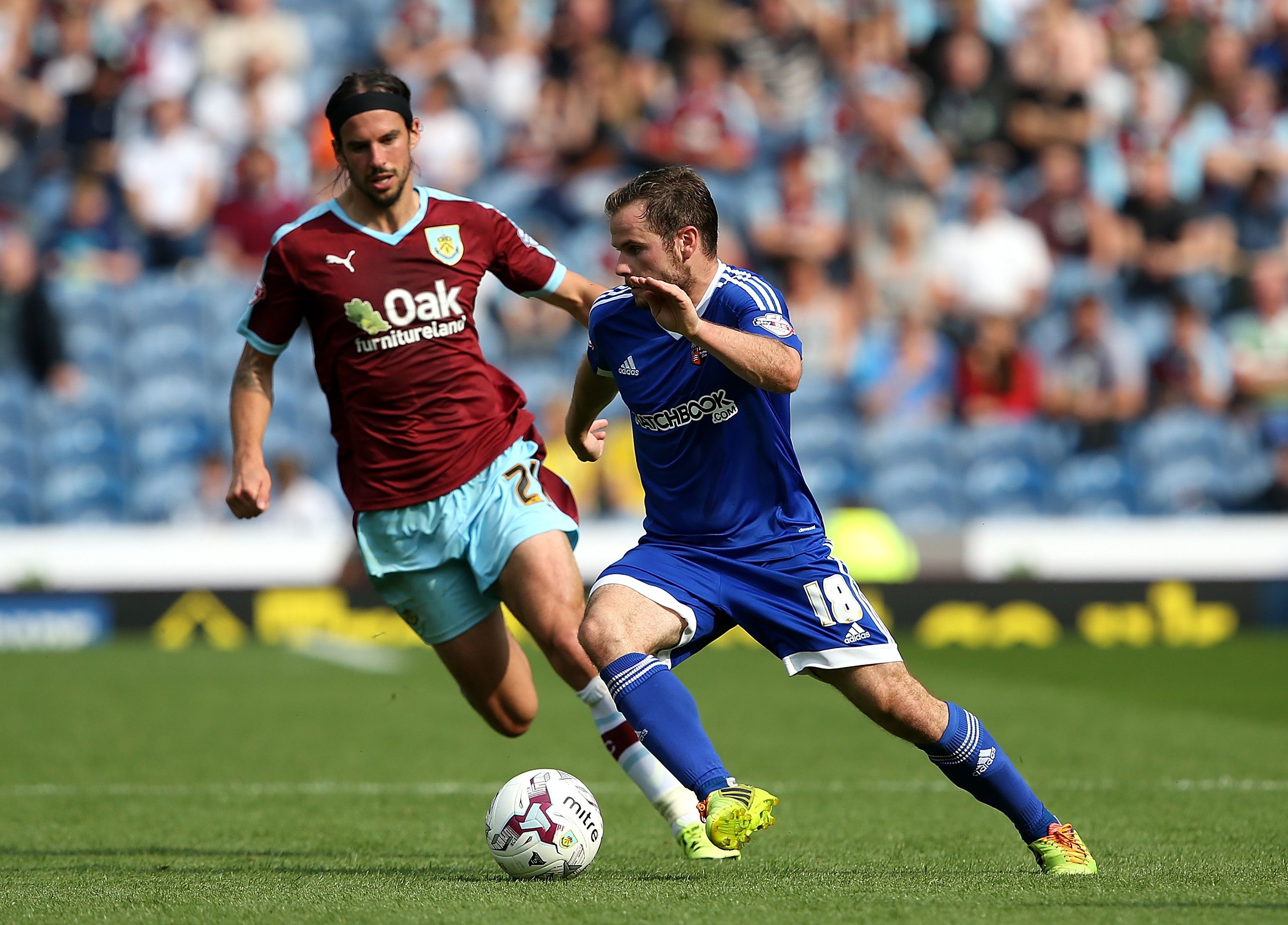
Where do we start with this? The v-neck is always a bad shout, but this one was terrible. Either side of that weird v-neck was the badge and manufacturer logo, placed unusually high up the shirt. That all made space for an obnoxiously large Oak Furnitureland logo in the middle. Back to the drawing board.
BURNLEY, ENGLAND - AUGUST 22: Alan Judge of Brentford holds off George Boyd of Burnley during the Sky Bet Championship match between Burnley and Brentford at Turf Moor on August 22, 2015 in Burnley, England. (Photo by Jan Kruger/Getty Images)
Chelsea - 2021/22
A controversial entry, Chelsea's worst ever home kit is - at the time of writing - their most recent. Seriously, this is a travesty. The main sponsor is massive and the v-neck is strange, but what makes it horrendous is that cheap design. It looks like a knock-off you'd come across in a random market when on your summer holidays. Will give you a headache after looking at it for a while, too.
LEEDS, ENGLAND - MAY 11: Christian Pulisic of Chelsea celebrates after scoring their side's second goal during the Premier League match between Leeds United and Chelsea at Elland Road on May 11, 2022 in Leeds, England. (Photo by Stu Forster/Getty Images)
Frenkie de Jong to Man Utd latest (Football Terrace)
Crystal Palace - 1998/99
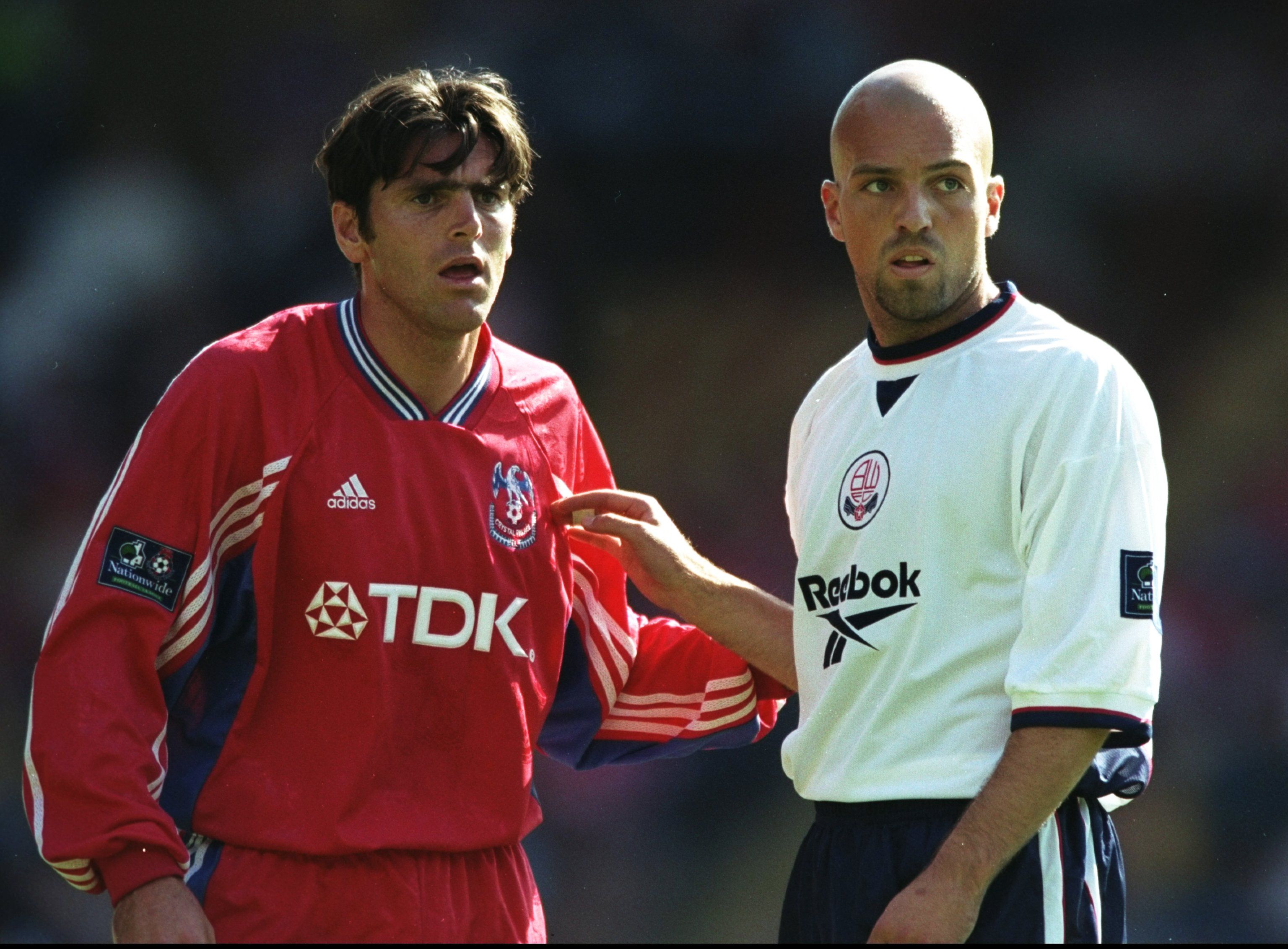
Admittedly, this isn't a 'bad' looking shirt, per say. It's just not at all what Crystal Palace should be playing in for most of a season. If there's one thing that should always be on a Palace shirt, it's the red and blue stripes. adidas doing away with them was a major oversight.
8 Aug 1998: Marc Edworthy of Crystal Palace stands next to Arnas Gunlauggson of Bolton Wanderers during a Nationwide Division One match at Selhurst Park in London. The match ended in a 1-1 draw. \ Mandatory Credit: Shaun Botterill/Allsport
Everton - 2012/13
The first of two underwhelming years with Nike as kit supplier, the sportswear giants must've thought Everton lacked leaders. To combat this, they added a captain's armband on either shirt sleeve. Properly strange design philosophy; another one that looks like a counterfeit.
LIVERPOOL, ENGLAND - JANUARY 30: Leighton Baines of Everton celebrates after scoring the first goal during the Barclays Premier League match between Everton and West Bromwich Albion at Goodison Park on January 30, 2013 in Liverpool, England. (Photo by Clive Brunskill/Getty Images)
Leeds United - 2013/14
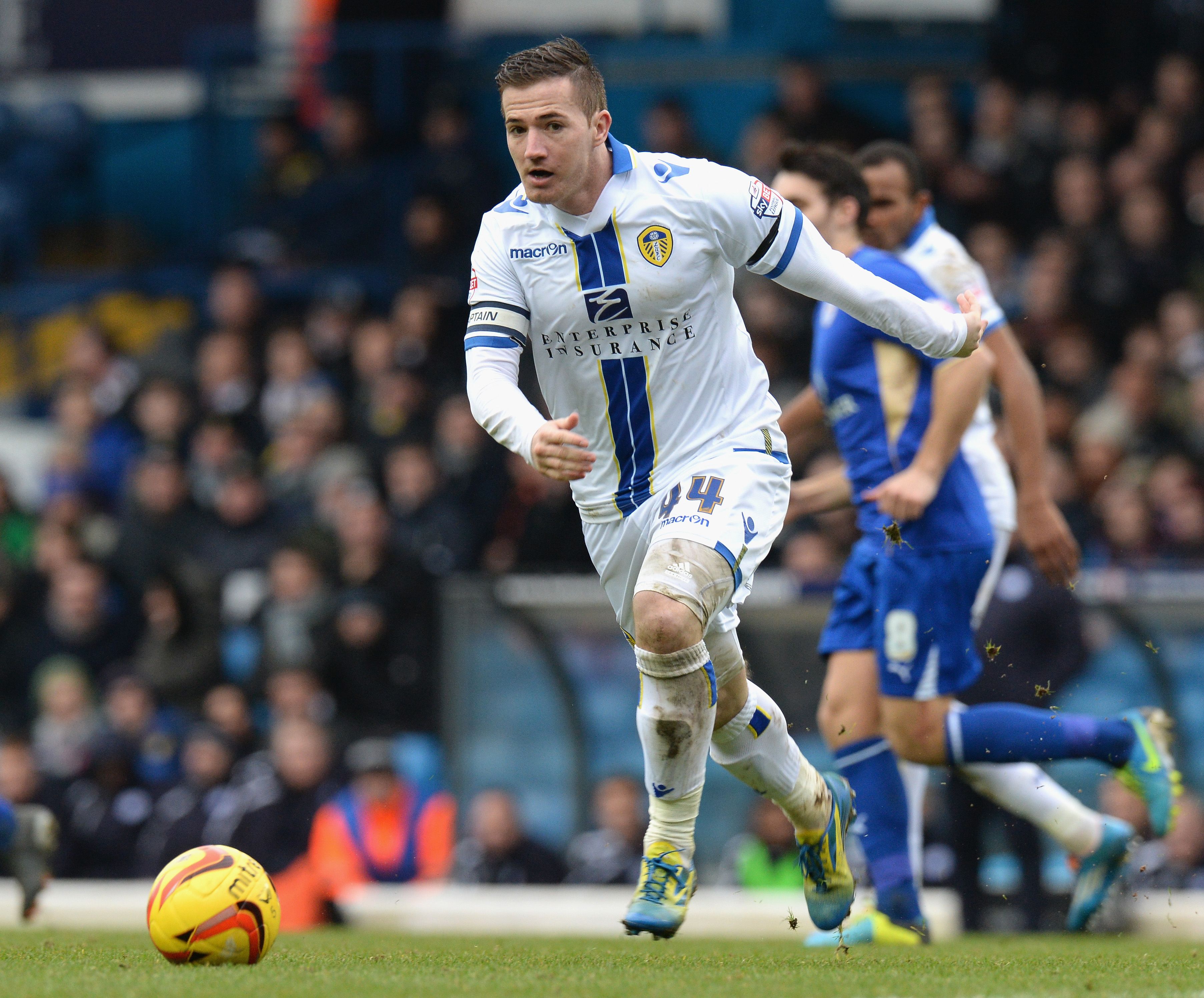
Fair play to Macron for trying to put a modern twist on a difficult home shirt to redo season upon season. Respect the effort. It just didn't pay off. At all. Putting a big blue stripe down the front of the kit completely undoes Leeds' clean, white look. A poor shirt from a forgettable era.
LEEDS, ENGLAND - JANUARY 18: Ross McCormack of Leeds United during the Sky Bet Championship match between Leeds United and Leicester City at Elland Road on January 18, 2013 in Leeds, England, (Photo by Tony Marshall/Getty Images)
Leicester 2009/10
Celebrating 125 years of the club, Leicester’s celebratory shirt was fairly underwhelming, in truth. The centre logo looks odd, and the Joma design is painfully basic, with a strange, faux-look v-neck. Looks like a school PE kit.
LEICESTER, ENGLAND - SEPTEMBER 15: Richie Wellens of Leicester City during the Coca-Cola Championship match between Leicester City and Peterborough United at The Walkers Stadium on September 15, 2009 in Leicester, United Kingdom. (Photo by Michael Regan/Getty Images)
Liverpool 2012/13
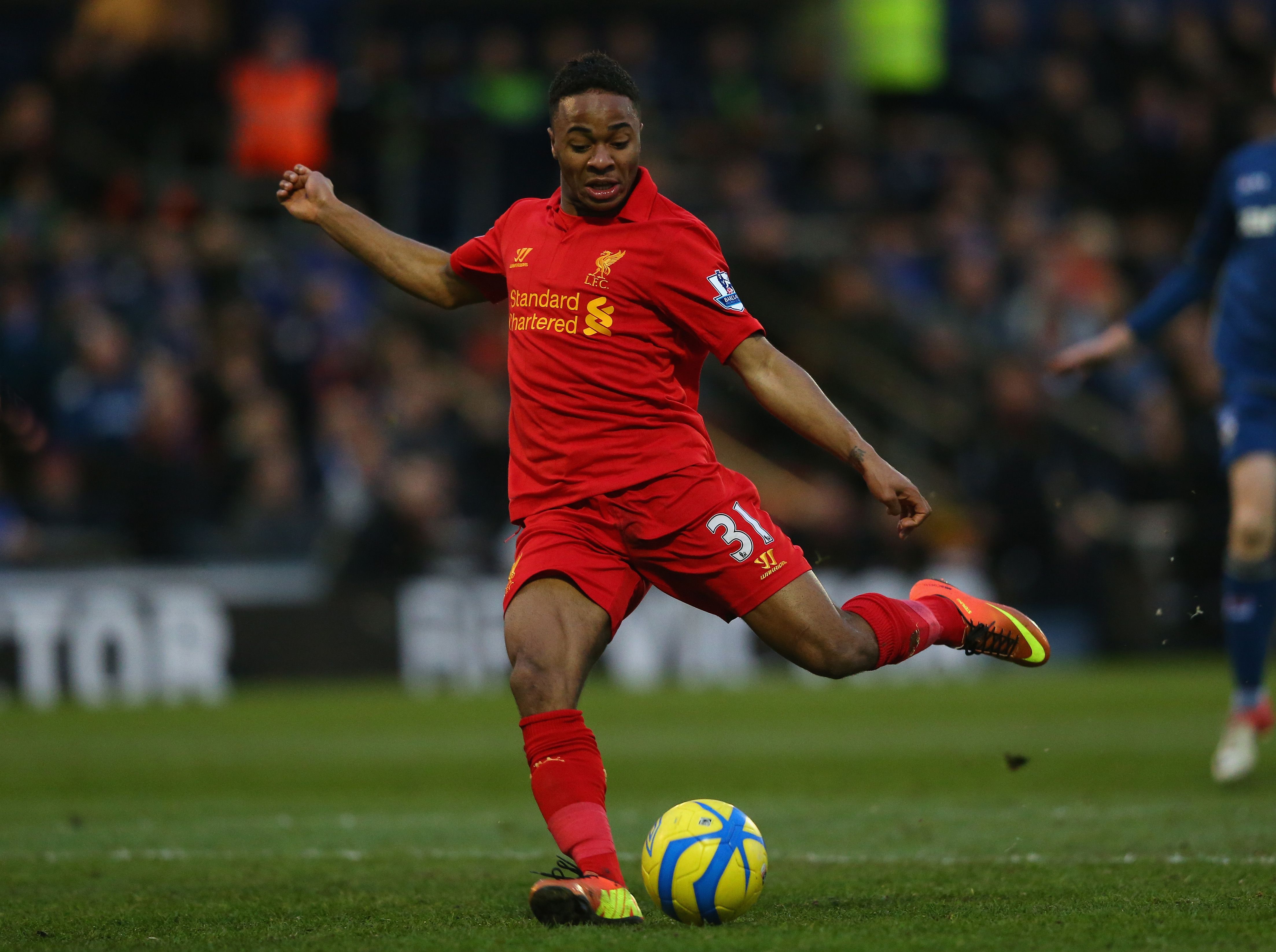
Oh, the Warrior years. What a time to be alive. While the real crimes were committed in the away and third kit department, home strips weren't all that great either. 2012/13 saw a weird shade of yellow, and a collar that made it look like the kit man had butchered Liverpool's shirts in the drier.
OLDHAM, ENGLAND - JANUARY 27: Raheem Sterling of Liverpool in action during the FA Cup with Budweiser Fourth Round match between Oldham Athletic and Liverpool at Boundary Park on January 27, 2013 in Oldham, England. (Photo by Alex Livesey/Getty Images)
Manchester City - 2008/09
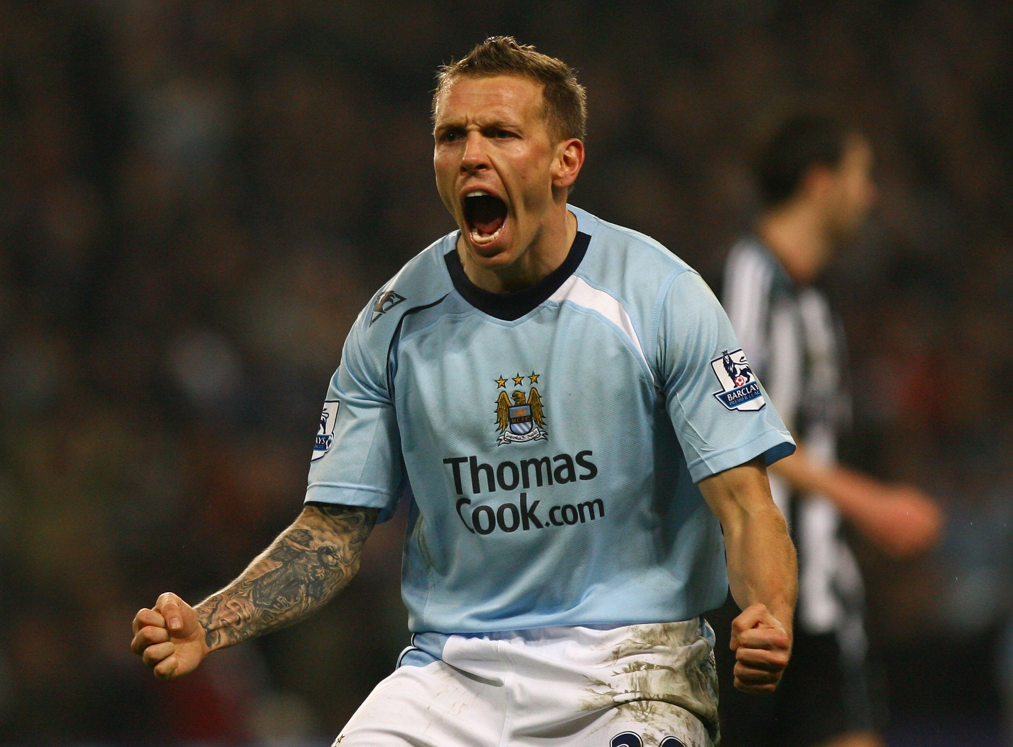
While there is a lot of love for Le Coq Sportif in general, this one hasn't aged well on the eye. City's 2008/09 offering looked more like a rugby shirt than a football shirt, especially with such a strange fit. Considering the classy home shirts Umbro produced the following season, it wasn't the strongest effort.
MANCHESTER, UNITED KINGDOM - JANUARY 28: Craig Bellamy of Manchester City celebrates scoring his team's second goal during the Barclays Premier League match between Manchester City and Newcastle United at The City of Manchester Stadium on January 28, 2009 in Manchester, England. (Photo by Alex Livesey/Getty Images)
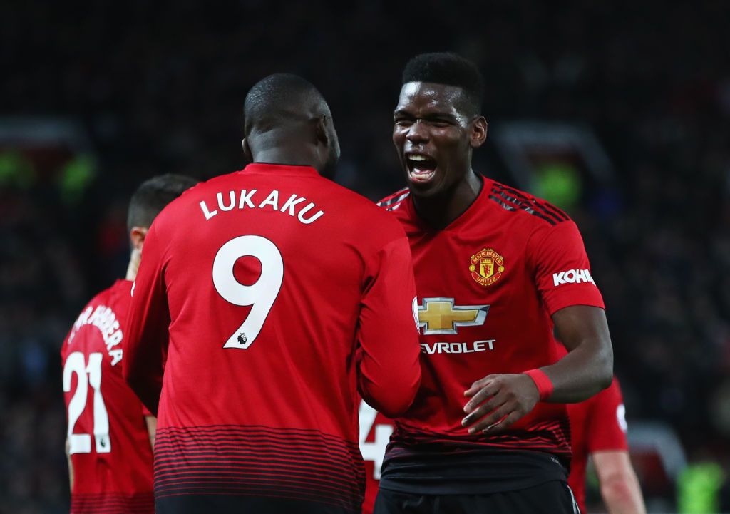
Manchester United - 2018/19
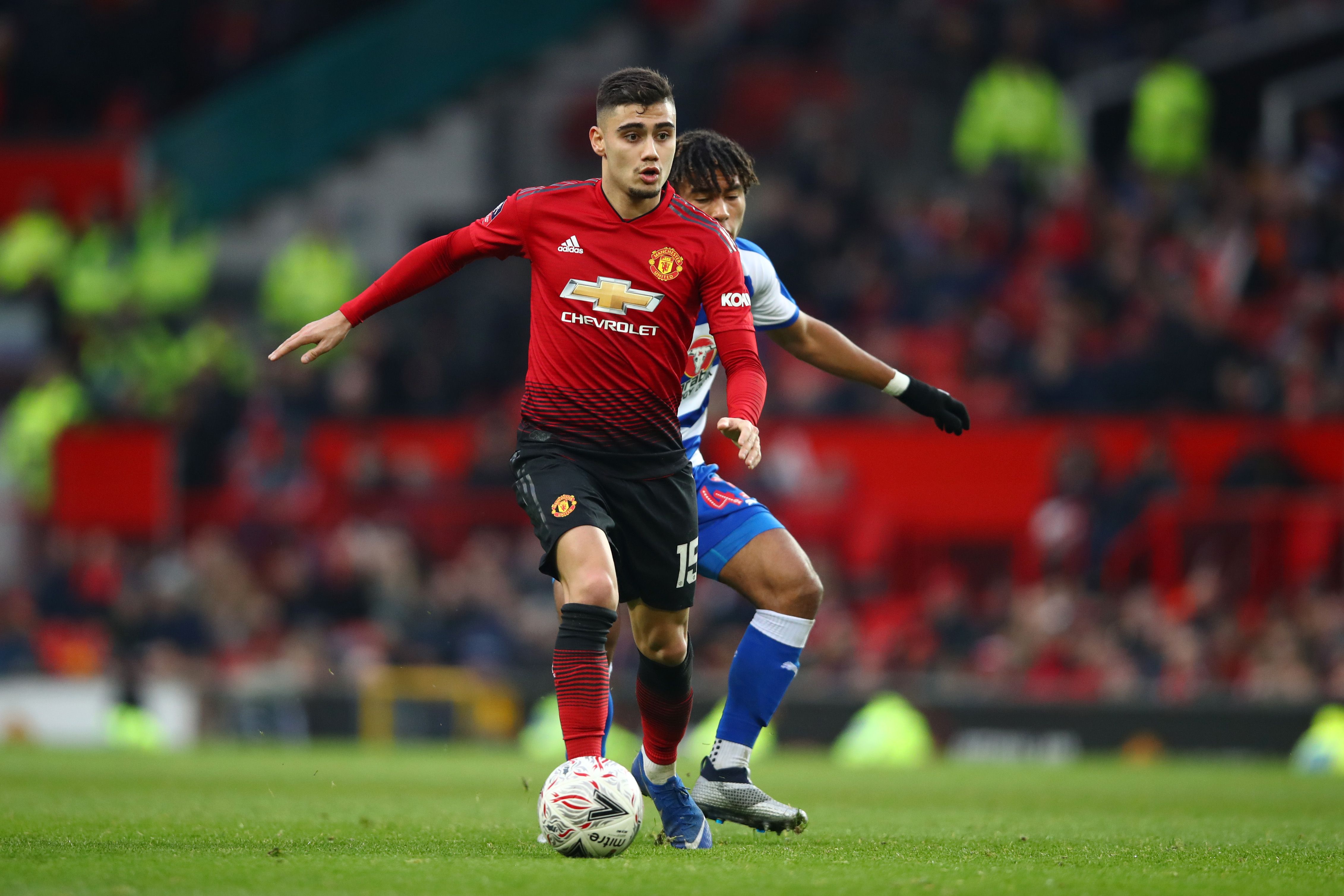
Too much black. Far too much black. adidas' decision to gradient very poorly from red to black on a Manchester United shirt was just odd. What's worse, they paired it up with black shorts and red socks as standard. An absolute abomination from head to toe. Easily United's worst home shirt.
MANCHESTER, ENGLAND - JANUARY 05: Andreas Pereira of Manchester United in action during the FA Cup Third Round match between Manchester United and Reading at Old Trafford on January 5, 2019 in Manchester, United Kingdom. (Photo by Clive Brunskill/Getty Images)
Newcastle United - 2014/15
Ah, the John Carver days. Summarised by that horrific Wonga sponsor in an obnoxious blue that sat directly below a random patch of black on the chest, this kit was a mess. The sleeves on the 'short sleeve' version of the kit also looked uncomfortably long. Very poor effort.
NEWCASTLE UPON TYNE, ENGLAND - JANUARY 01: Steven Taylor of Newcastle United celebrates scoring the opening goal during the Barclays Premier League match between Newcastle United and Burnley at St James' Park on January 1, 2015 in Newcastle upon Tyne, England. (Photo by Mark Runnacles/Getty Images)
Norwich - 2015/16
Half and half shirts can either look the bee's knees or, well, like this. Norwich's half and half shirt for the 2015/16 went down like a lead balloon with fans, and understandably so. Seriously, what on earth is that giant yellow square around the sponsor, and why does it cut into the green like that? Wouldn't even see that at Sunday league level.
NORWICH, ENGLAND - JANUARY 2: Jonny Howson of Norwich City during the Barclays Premier League match between Norwich City and Southampton at Carrow Road stadium on January 2, 2016 in Norwich, England. (Photo by Stephen Pond/Getty Images)
Southampton - 2019/20
For all of the solid and rather creative efforts Under Armour have produced for Southampton, their 2019/20 iteration of the home shirt didn't quite land. Weird stripes, a properly random black chest, an even more random button, and a horrific looking sponsor. Looks like three shirts crammed into one.
SOUTHAMPTON, ENGLAND - JANUARY 18: Shane Long of Southampton celebrates scoring his sides second goal during the Premier League match between Southampton FC and Wolverhampton Wanderers at St Mary's Stadium on January 18, 2020 in Southampton, United Kingdom. (Photo by Bryn Lennon/Getty Images)
Tottenham - 2005/06
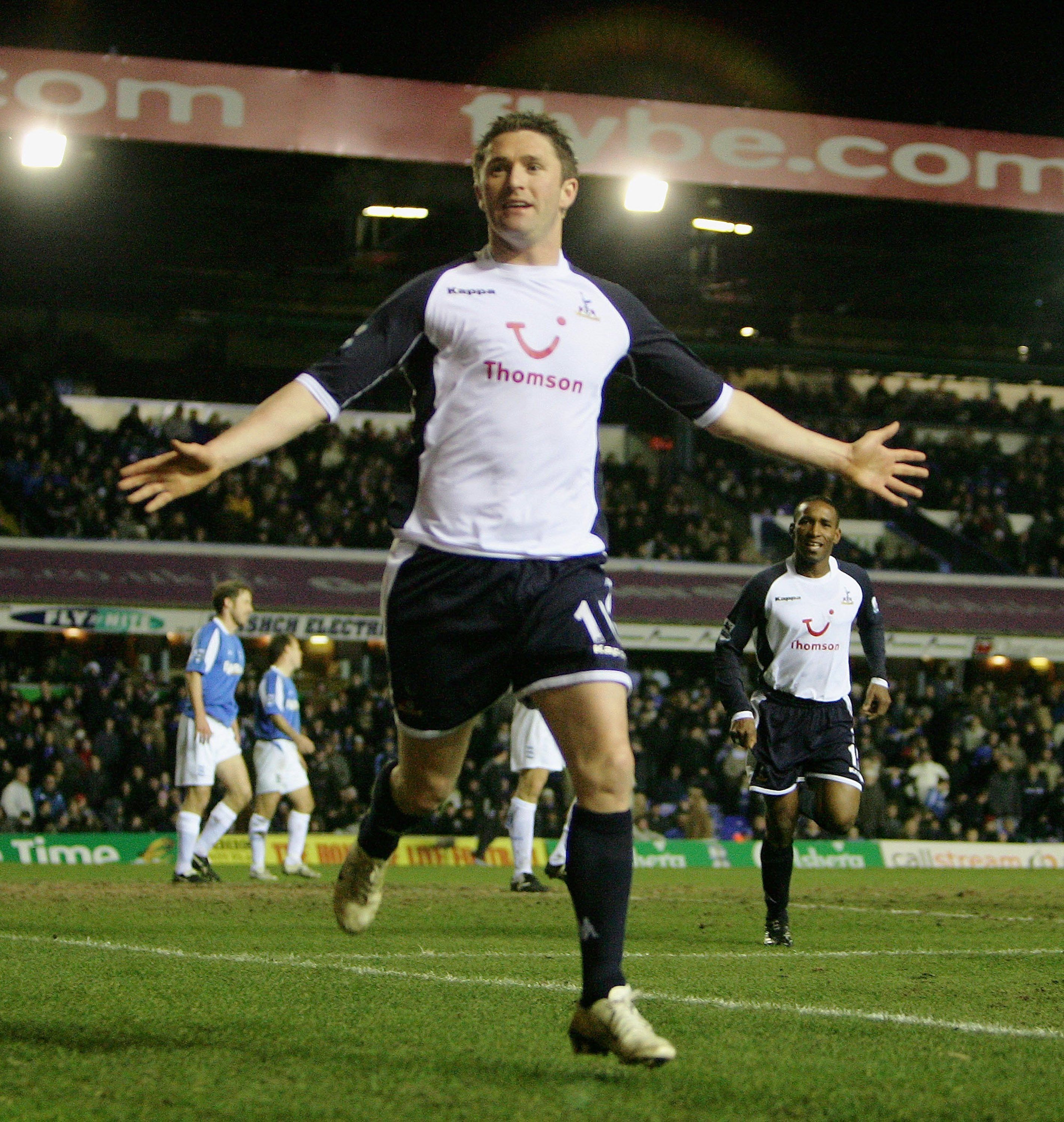
Kappa is a polarising brand, and their tight-fit shirts divided opinion. Tottenham's 2005 effort looked ridiculous. The dark sleeves against the white and all of the strange stitching makes the kit resemble a cheap thermal, while the red Thomson sponsor sticks out like a sore thumb.
MANCHESTER, UNITED KINGDOM - MARCH 16: Robbie Keane of Spurs celebrates scoring the second goal during the Barclays Premiership match between Birmingham City and Tottenham Hotspur at St Andrews on March 18, 2006 in Birmingham, England. (Photo by Laurence Griffiths/Getty Images)
Watford - 2020/21
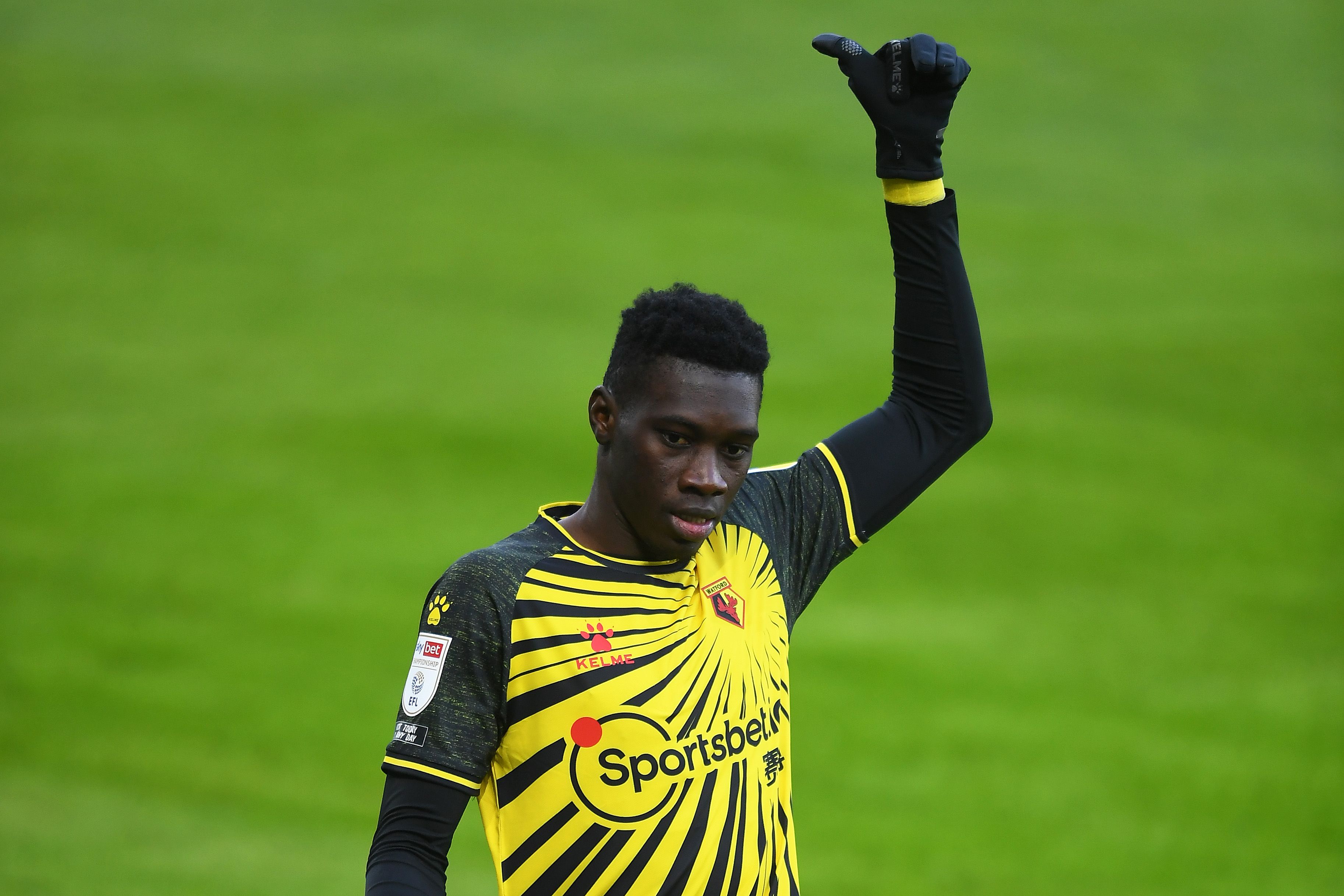
Of all the kits you could win promotion back to the Premier League in, this was not the one, Watford. Where do you even start? The design on the front just looks like your youngest has found a black marker and taken to your new shirt with it, and the 'black' sleeves look like they've faded in the wash.
SWANSEA, WALES - JANUARY 02: Ismaila Sarr of Watford during the Sky Bet Championship match between Swansea City and Watford at Liberty Stadium on January 02, 2021 in Swansea, Wales. The match will be played without fans, behind closed doors as a Covid-19 precaution. (Photo by Harry Trump/Getty Images)
West Ham - 2008/09
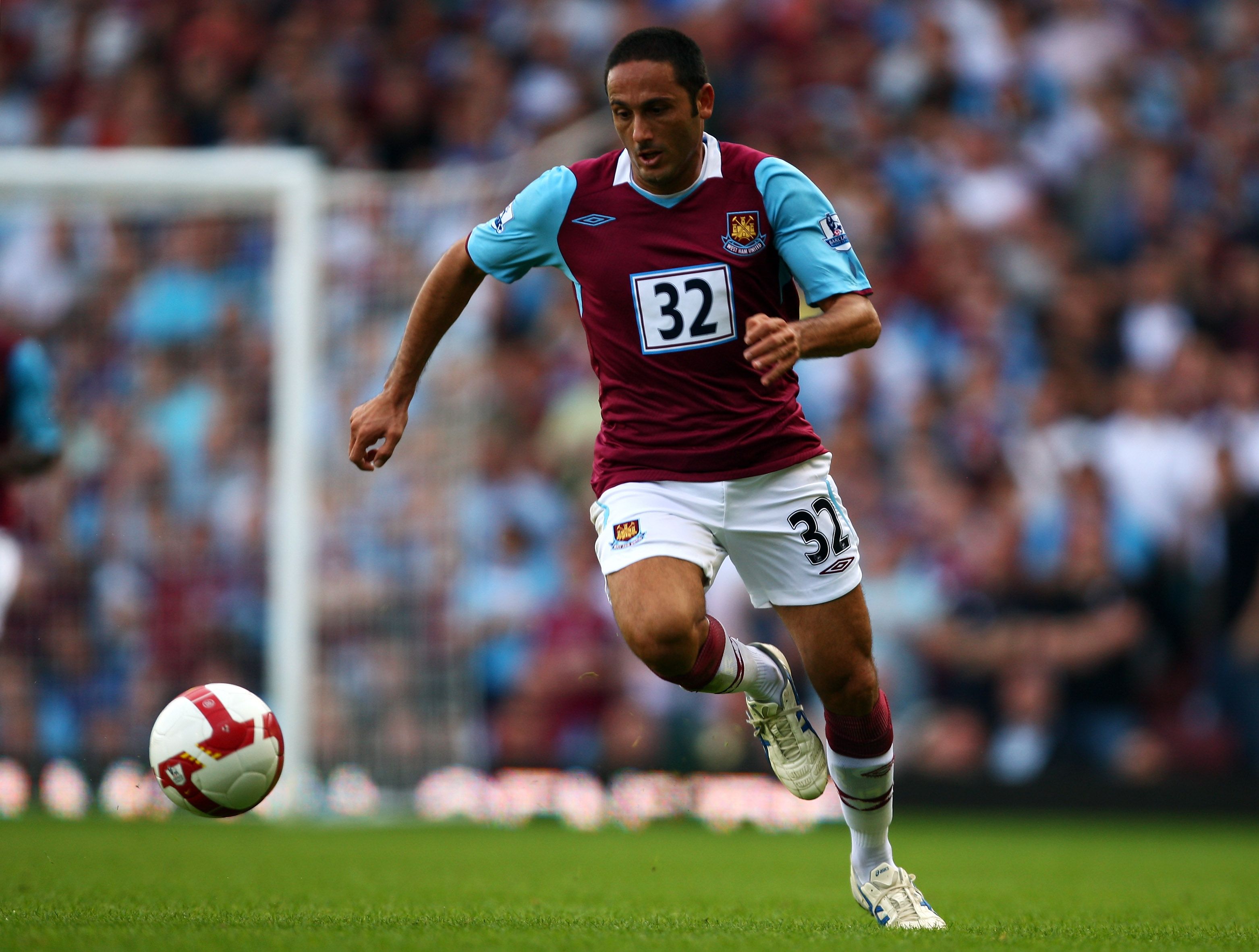
Umbro's template was questionable for the Hammers this season, with the club crest and logo placed awkwardly high up. However, what made it worse was West Ham's decision to do a patch-up job when their main sponsor went bust, printing shirt numbers onto the front on a horrific white background. What an eyesore.
LONDON - SEPTEMBER 20: David Di Michele of West Ham in action during the Barclays Premier League match between West Ham United and Newcastle United at Upton Park on September 20, 2008 in London, England. (Photo by Mike Hewitt/Getty Images)
Wolves - 1992/94
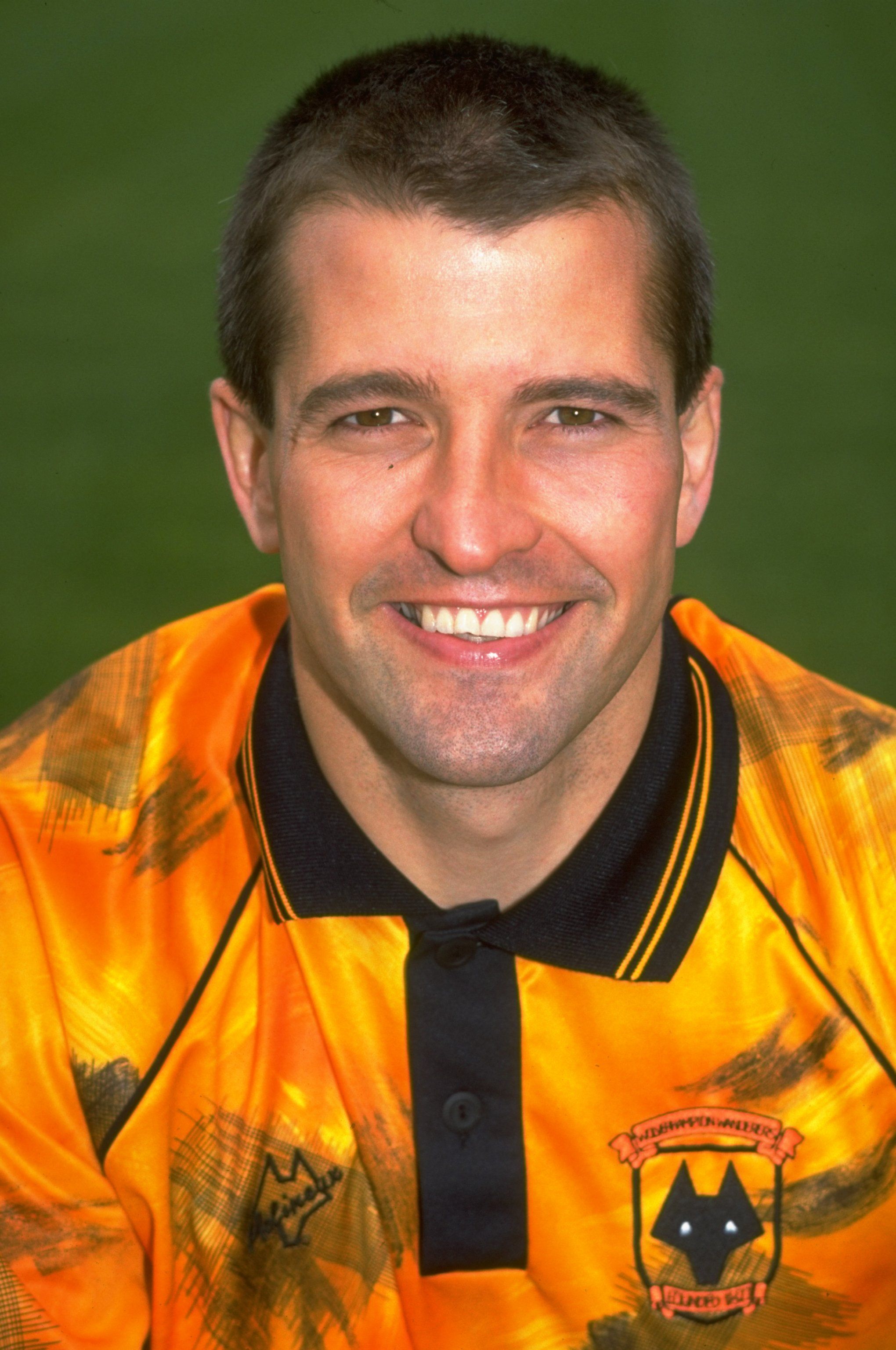
Wolves were up into the First Division - the second tier of English football - by 1992, but by the look of their home shirt, you'd have been convinced all their players worked at a car garage part time. Their traditional orange was tinged with very sporadic brushstrokes of black, as if someone had been hired to do burnouts on their home shirt.
1992: Portrait of Steve Bull of Wolverhampton Wanderers during a photocall at the Molineux Grounds in Wolverhampton, England. \ Mandatory Credit: Gary M Prior/Allsport

