


Arsenal, Real Madrid, Liverpool and more have all gotten the football kit season underway with their releases for the 2022/23 campaign.Once the curtains have been drawn on all the club football action of the year, supporters often turn their attention to the apparel that their beloved players will be sporting next time out.After all, pooh-pooh annual releases of home, away, third and fourth kits as much as you like, there's no denying that they can take on a wider cultural significance that transcends the sport.
It's kit season for 2022/23
It only takes a memorable trophy-winning campaign or era-defining goal to be produced in a certain kit to ensure that it's enshrined in the minds of millions for years and years to come.
However, there are some jerseys that, well, fall so far short of the mark that even lifting a Premier League title or scoring a bicycle kit in its threads can't stop fans from turning their noses up at it.
And while the judgement of football shirts is - of course - ultimately a subjective exercise, we can't escape the fact that certain designs are loved a lot less than others across the board.

Soccer Football - Premier League - Chelsea v Fulham - Stamford Bridge, London, Britain - December 2, 2018 General view of Christmas merchandise inside the Chelsea club shop REUTERS/Eddie Keogh EDITORIAL USE ONLY. No use with unauthorized audio, video, data, fixture lists, club/league logos or "live" services. Online in-match use limited to 75 images, no video emulation. No use in betting, games or single club/league/player publications. Please contact your account representative for further details.
Some kits are better than others
Liverpool fans must want to forget the 'tribal tattoos' on their shocking 2012/13 third kit just in the way that Barcelona fans probably want to dispel the memory of their horrid half-orange-half-yellow away strip from the same year.
And although none of the 2022/23 designs on the table for the upcoming campaign quite sink to those distressing lows, there are undoubtedly some mishits amongst the gems being lined up.
As such, here at GIVEMESPORT, we're taking the rough with the smooth by following up our round up of the best kits set for the 2022/23 season with the very worst.
The worst 2022/23 kits so far
Using the intel of kit experts Footy Headlines, we've compiled a mixture of confirmed and touted designs for the upcoming campaign that we think are the weakest of what we've seen so far.
Again, do bear in mind that this is simply the outlook of your humble writer - other opinions are available - who has the upmost respect for all the kit designers that continue to push football's wider culture significance.
It just happens that yours truly isn't such a fan of these 11 kits that have either been leaked or officially released for the 2022/23 campaign. Check them out down below:
1. Chelsea home
Let's face it, the collar just doesn't look good in practice. It's a pale imitation of the superb collar on England's Euro 2020 shirt with some even comparing it to toddlers' crayon doodling on paper.
2. Juventus away
If you want to know how to ruin a pretty solid football kit with just one design choice then look no further than having a Jeep logo with naff lightning graphics slapped in the middle of it.
3. Atletico Madrid home
No, you're not drunk, the stripes are genuinely contorted that way.
4. Newcastle United away
Look, there are two possible scenarios here. One, there are no ulterior motives going on here and it's just a pretty boring, nondescript away strip for the Toon in such a historic season.
Two... well, it doesn't really need saying, does it?
5. Chelsea third
A so-called 'Sesame' base with black and orange trimmings just isn't an attractive colour combination on a football shirt. Simple as that.
6. AC Milan third
Speaking of colour combinations that just don't work on a football shirt...
7. Atletico Madrid third
Another colour clash as the already-underwhelming 'Peach Cream' base of Atletico's alternate strip is further curtailed by the incorporation of an "Atomic Orange/Laser Crimson" two-stripe.
Mercifully only a concept graphic based on the leaked colours at this stage.
8. Wolverhampton Wanderers third
Maybe we just don't like warm pastel colours, but Wolves seem set to be sporting a sunburnt look next season.
9. Deportivo Toluca third
We want to like this, we want to like this so, so much, but the brilliant-on-paper nod to Mexico's 'DÃa De Muertos' lets all its potential slide with a slapdash finish that doesn't do it for us.
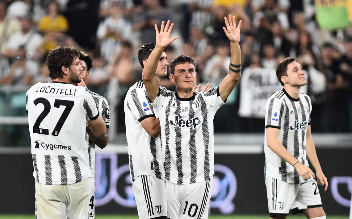
10. Juventus home
A Marmite kit, this, because it certainly has its admirers, but the tiny little geometric shapes building up the stripes feel gimmicky to us and look more like tractor tyre marks.

Soccer Football - Serie A - Juventus v Lazio - Allianz Stadium, Turin, Italy - May 16, 2022 Juventus' Dusan Vlahovic celebrates scoring their first goal with Paulo Dybala REUTERS/Massimo Pinca
11. Rangers away
Like, seriously, what is going on with the red here? Hopefully there's an earnest meaning going on behind this design choice because as things stand, it might be the worst kit of the bunch.
Look, it just so happens that they're not for us. If you happen to love the shirts that didn't float our boat, then power to you because there's no such thing as an objectively bad kit.
But let's face it, the twisty stripes of Atletico's home kit, the garish colour of Chelsea's third strip and the potential ulterior motives of Newcastle's away design do make them harder to love than others.